
The Windows Insider website was ready for a revamp, so I spearheaded building out initial strategy and designs to refocus the site on the core of the program, streamline content, processes, and tools, and refresh the look with improved UI/UX and Microsoft’s new, more accessible version of their web framework, MWFv2.
As part of this, I planned a new CMS and new localization service, pitched the work to leadership, and helped hire our third-party vendor for the project, Affirma, who I then moved to as a vendor.
At Affirma, I was a lead for the project, project managing the entire redesign, which included the sitemap, managing timelines and tasks, testing of designs and links, and reviews for compliance, accessibility, and quality. I also helped create design prototypes, selected all media, rewrote and coded all content, and did a full audit of back articles and podcasts to meet the latest style and quality standards as part of the redesign.
This redesign streamlined content and built a brand funnel, raising:
- Users by 113%
- Pageviews by 65%
- Pages per session by 27%
- Get started pageviews by 63%, registration pageviews by 333%, and returns to the funnel after registering by 380%
I would go on to manage all website content and page updates, including posting articles, podcasts, contests, rule pages, events, MVPs, homepage banners, and program updates, and managing bugs, feedback, and downtime. I also made a new system of reporting through Google Analytics and ContentSquare to analyze success and overhauled our Microsoft Docs site’s structure, content, and design to match the quality of our new website.
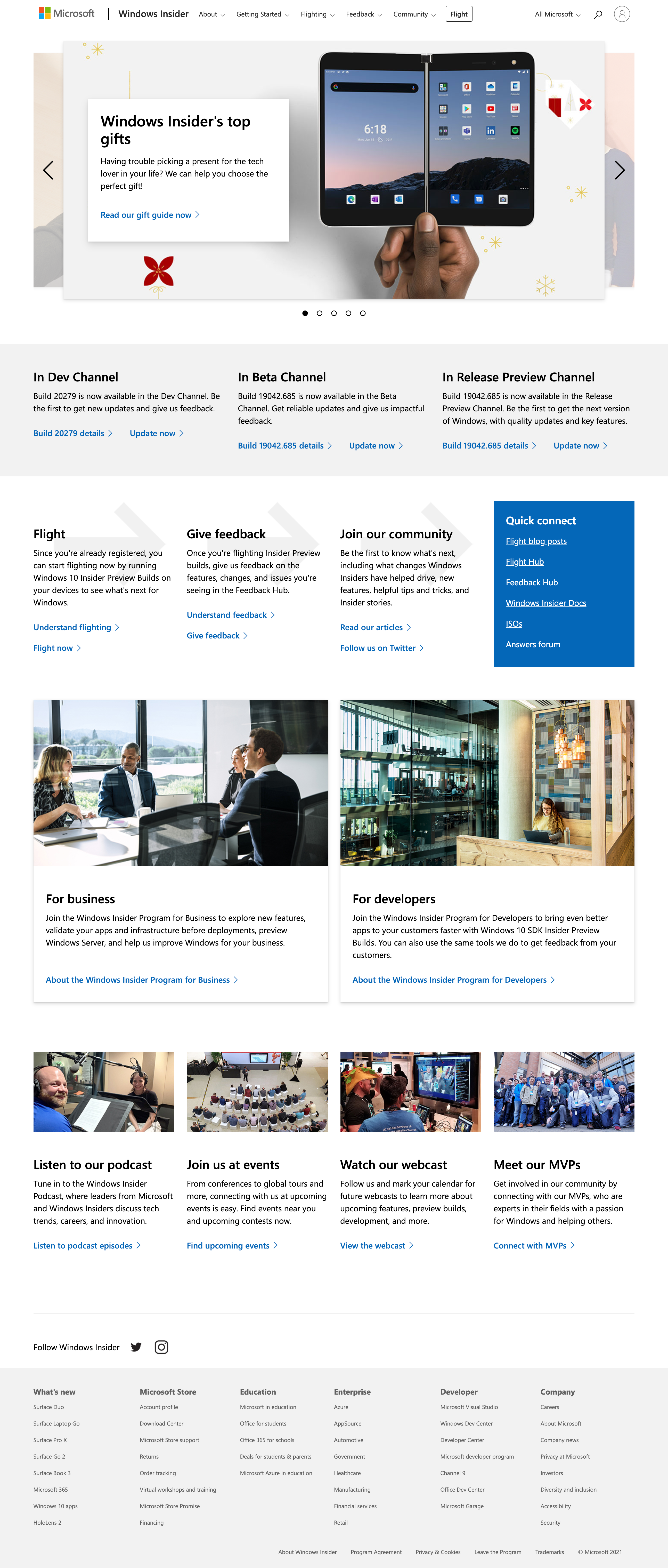
You can see the old homepage design on the left was very ready for the refresh on the right. The top section on registering only showed when users weren’t logged in with their Windows Insider account.


The full home page, but logged in:
The first step in our funnels for each audience was getting users to register, and our about pages for the different versions of the program were a key part of driving that registration. As you can see with the old design on the left, there was a lot of opportunity to better sell the program in the new design on the right.


See the full design of this about page, plus our about pages for business and developer versions of the program, and our educational pages on the other two pieces of the funnel, flighting and giving feedback, in this slideshow.


From there, our actual setup funnel pages needed a massive overhaul to be clearer and easier to follow. You can see the old design on the left and the new starting page on the right.


See the full funnel, which we also had full versions of for our business, developer, and server audiences, in this slideshow.


There were many more landing pages which we hadn’t supported before or had very minimal design. You can see new designs of these key elements in this slideshow.


