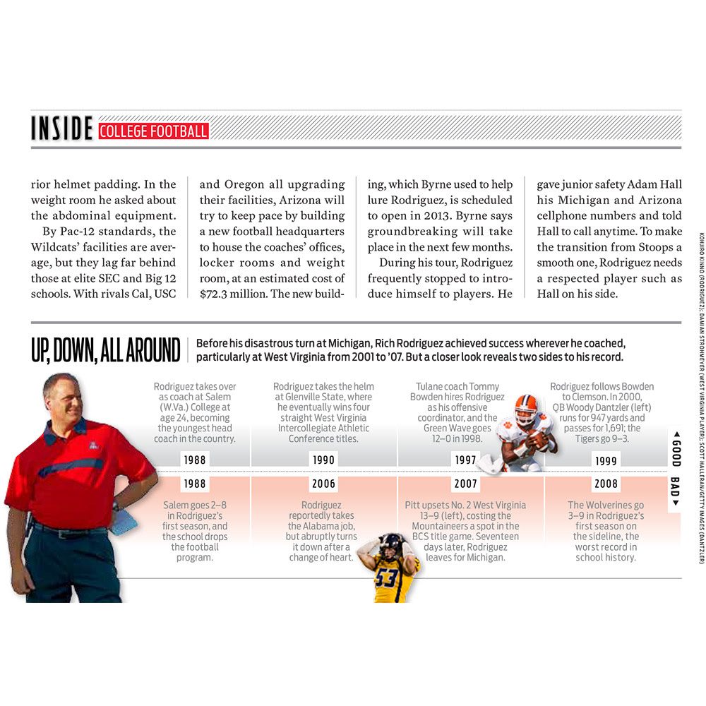
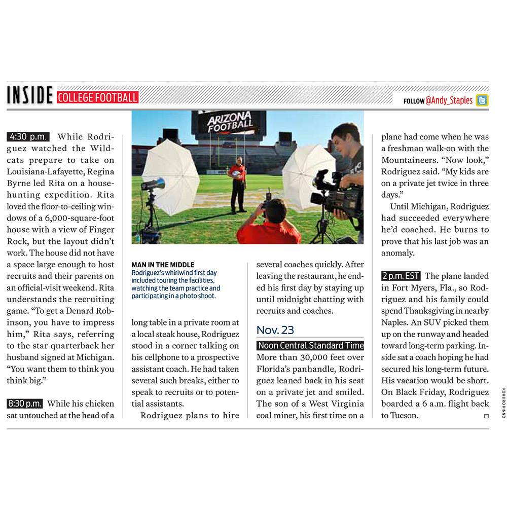
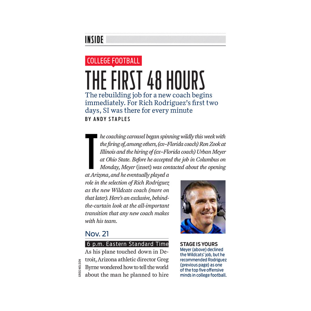
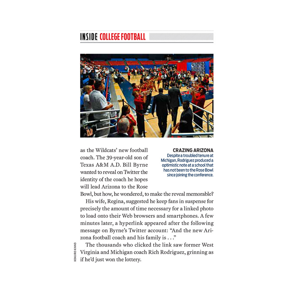
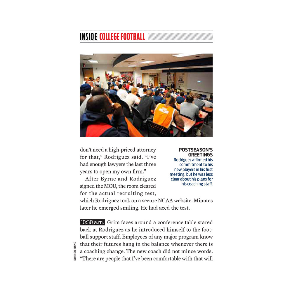
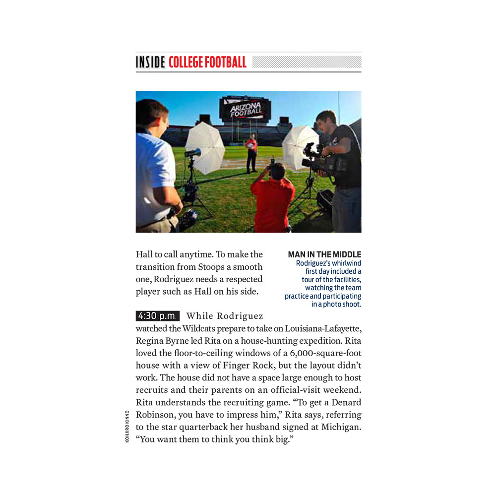
This story was laid out in print by another designer, and I reduced and laid it out across iPad and Galaxy for the December 5, 2011 issue of Sports Illustrated. This gives you an idea of how more difficult SI pages like columns and features get arranged differently across the apps.
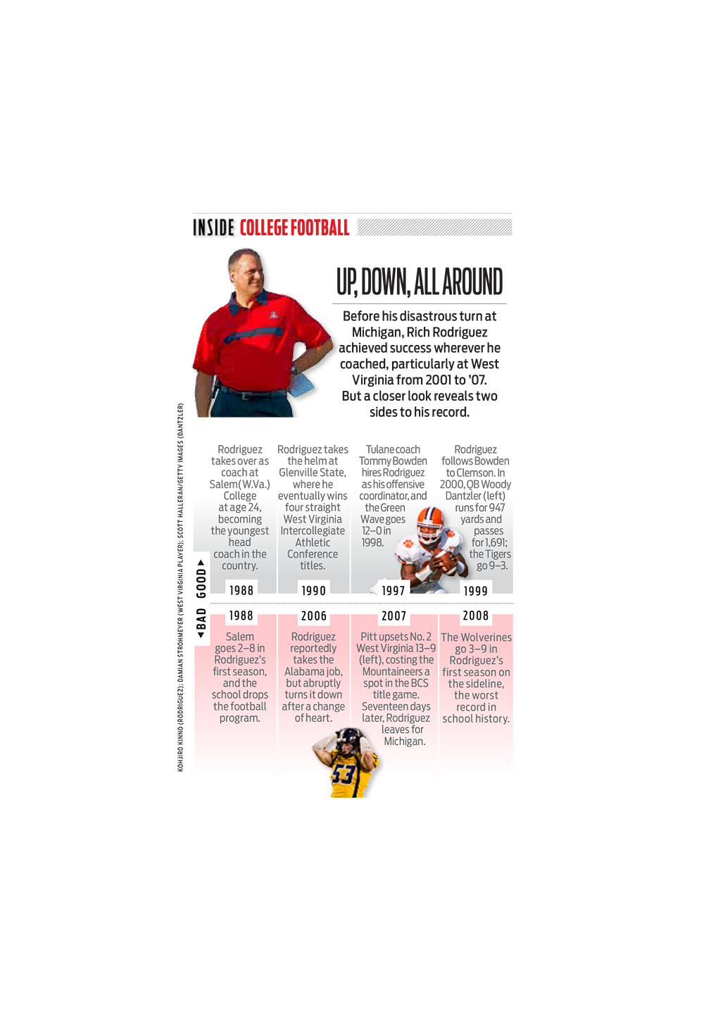
Overall, this story was pretty easy to lay out, but the Up Down, All Around page required all the elements of an intricate graph be reduced down and rebuilt in a much smaller space.
Anything like Truth and Rumors that says live feed was fed into the app from the internet, so it’s missing in this format. Scroll text also stretches past where it did on the actual app in this format.


