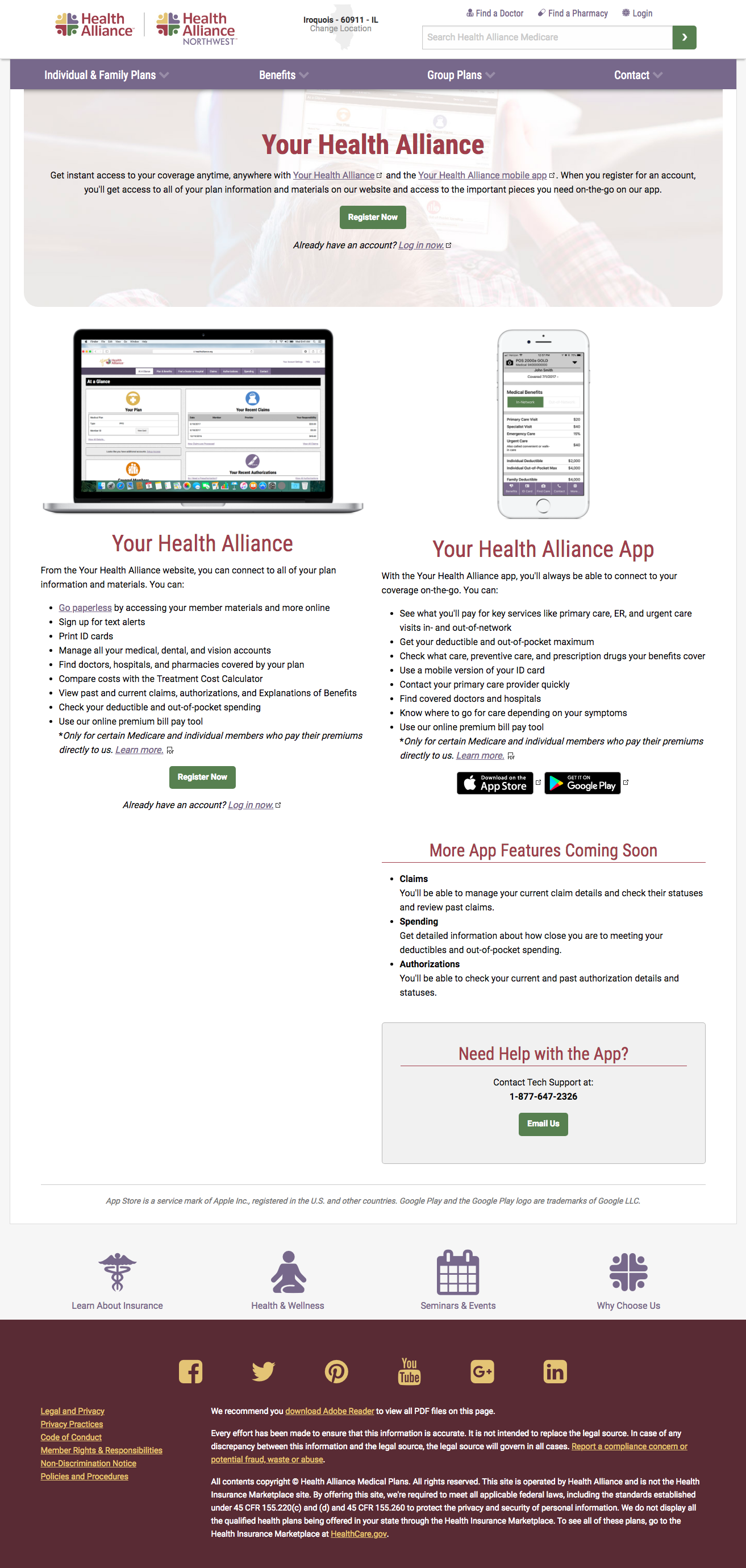
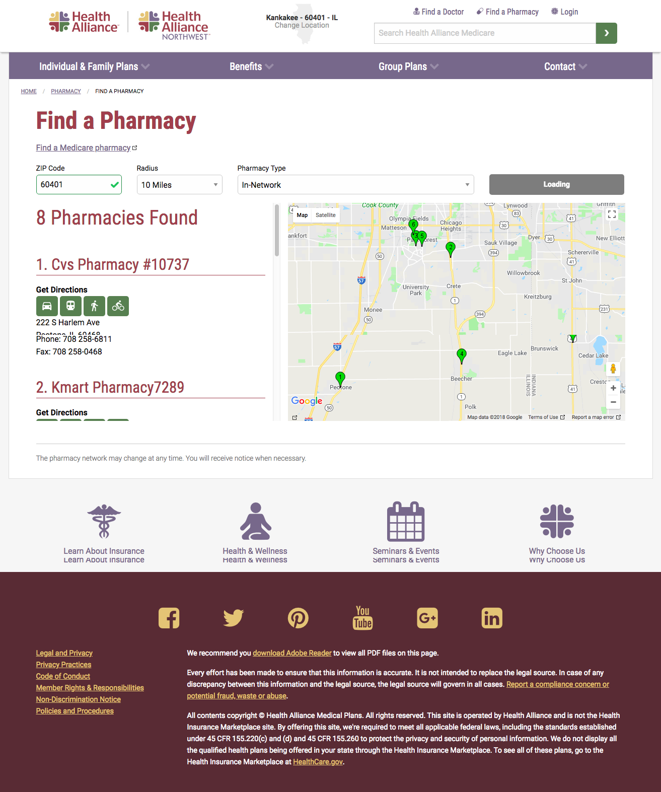
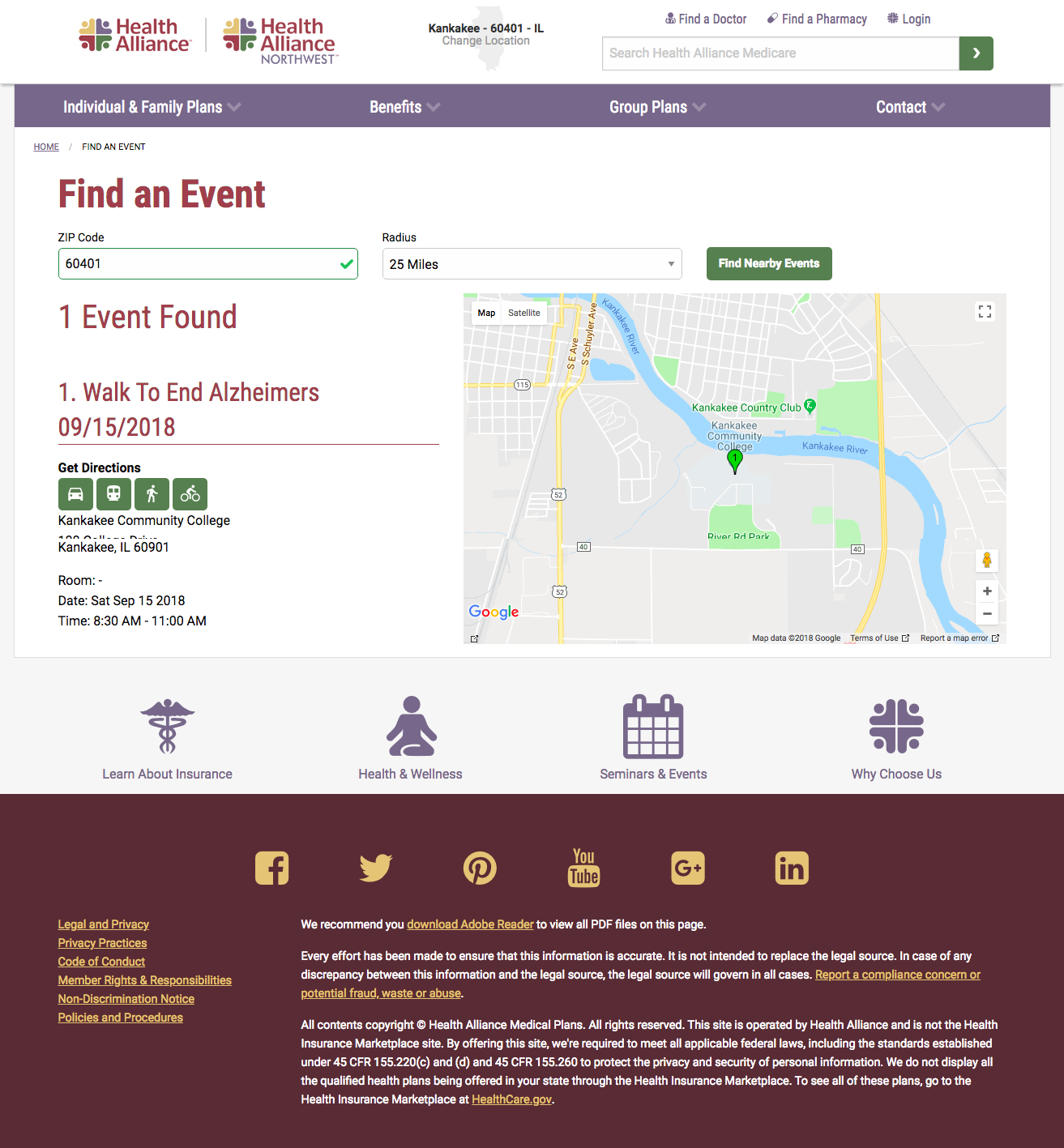
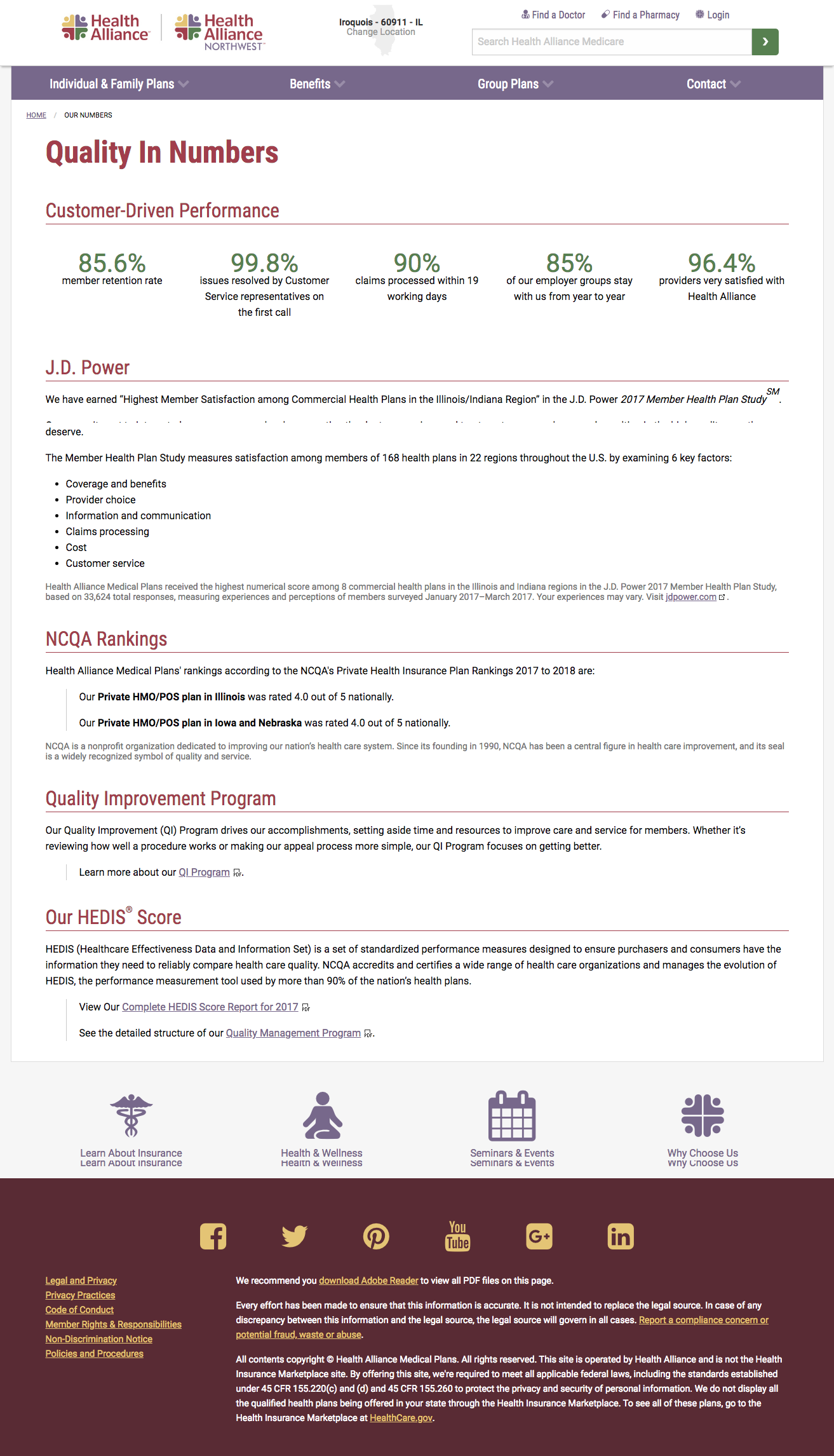
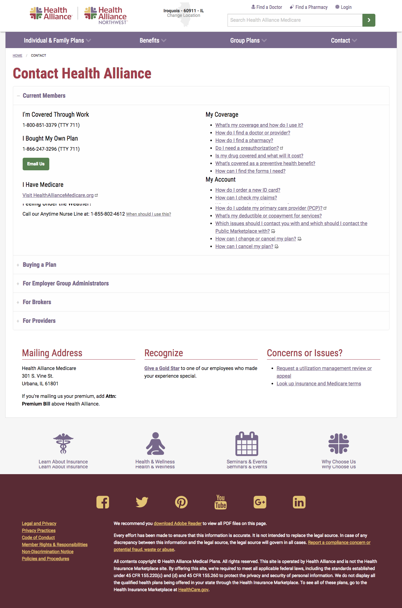
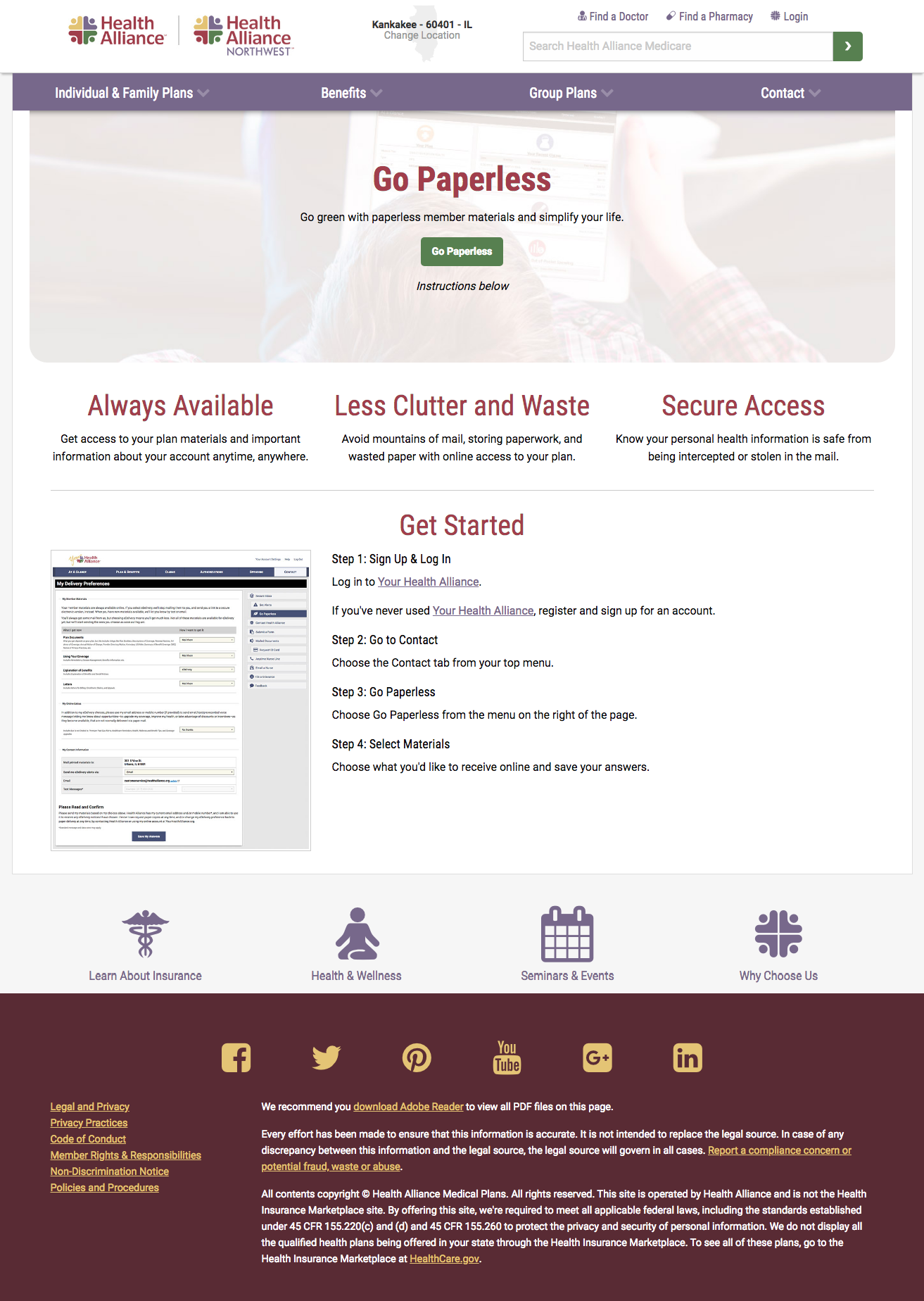
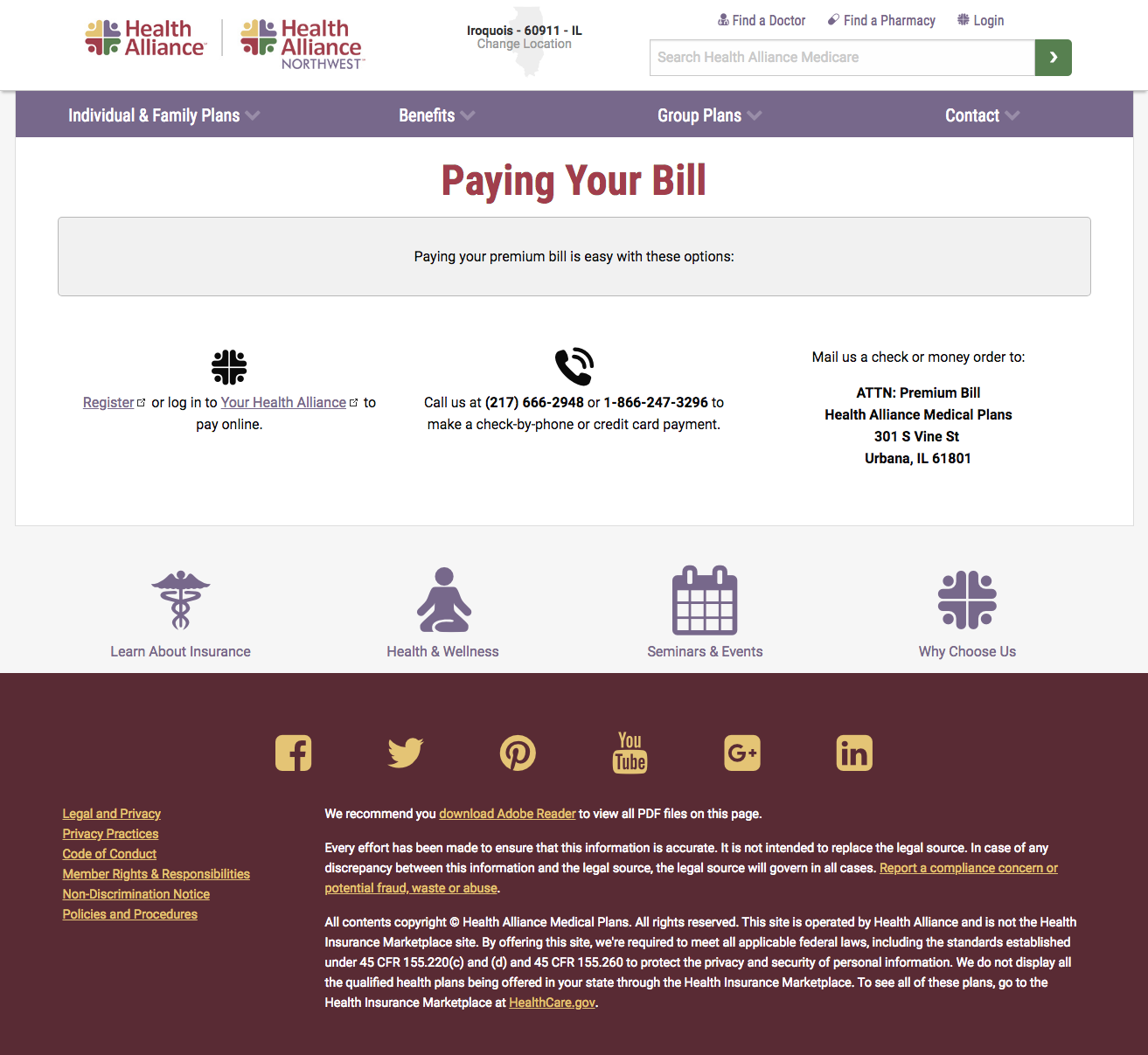
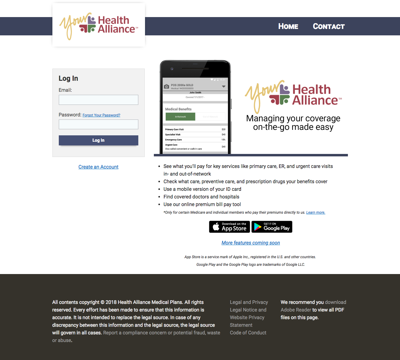
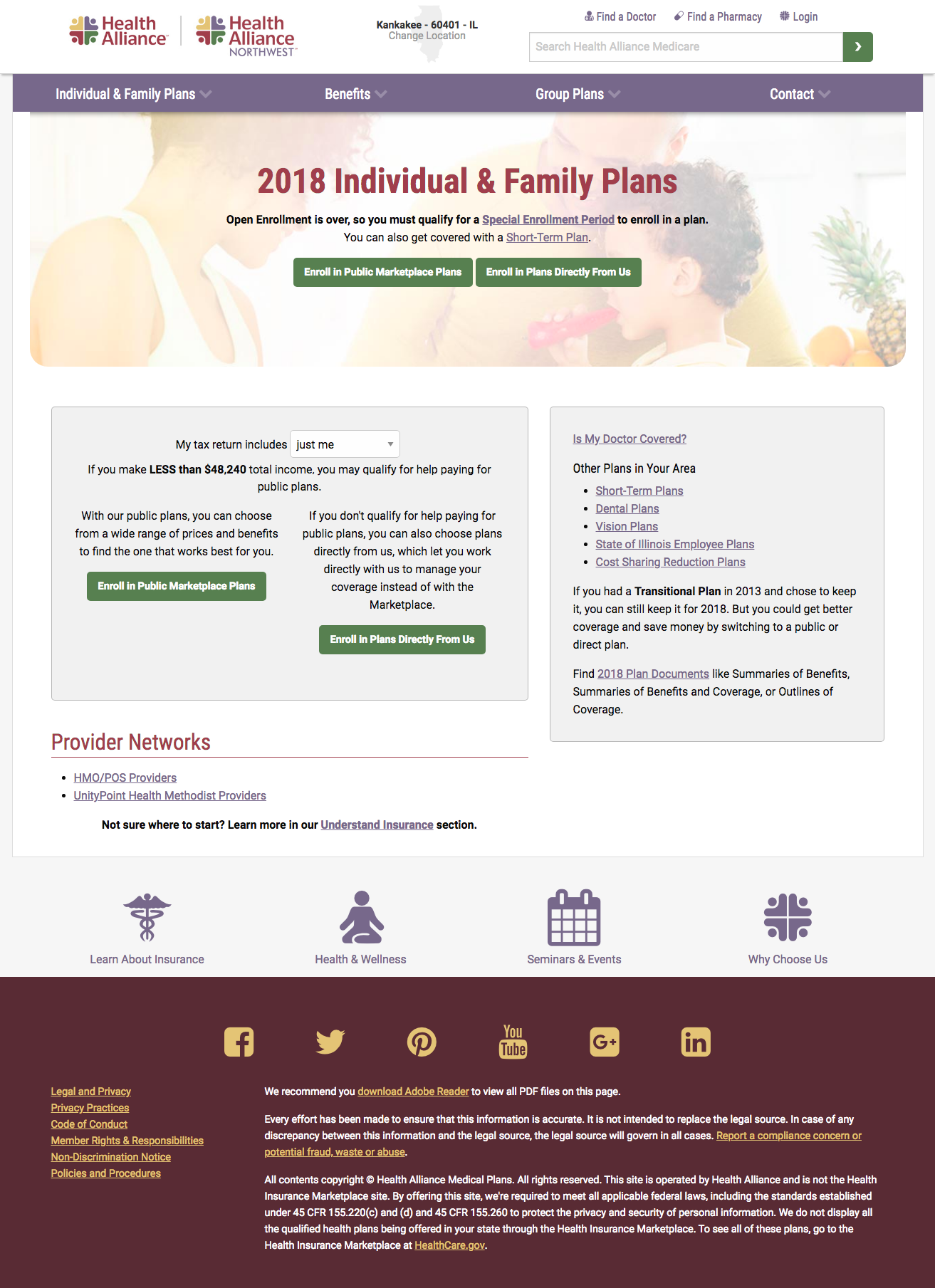
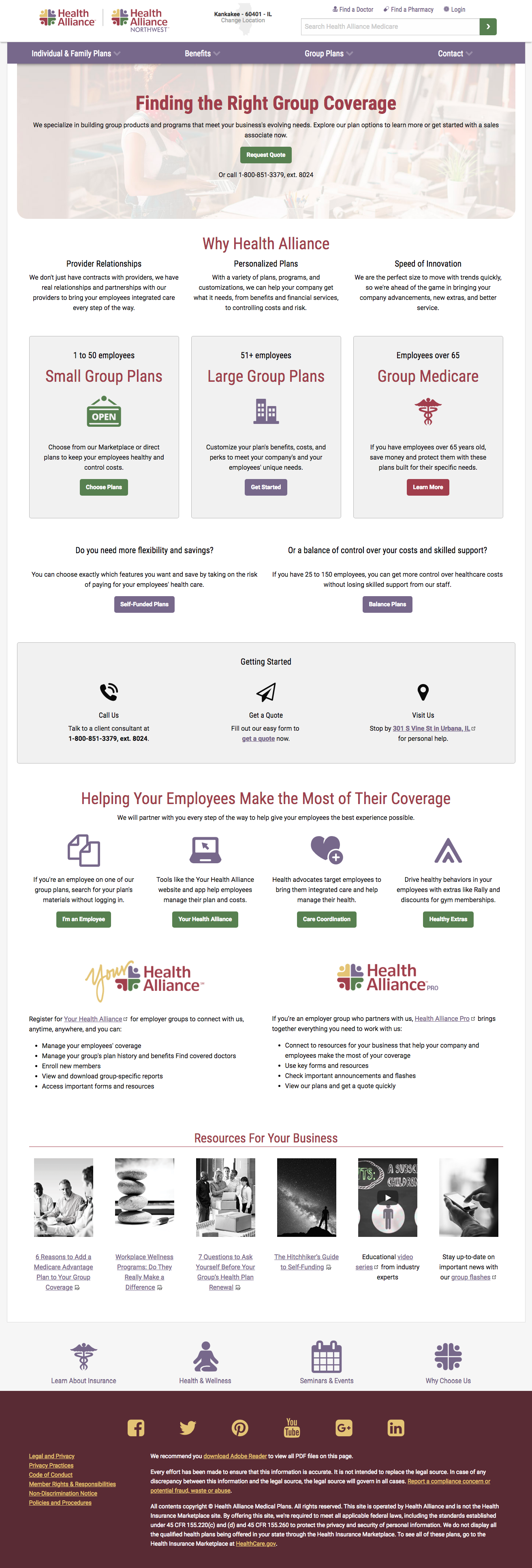
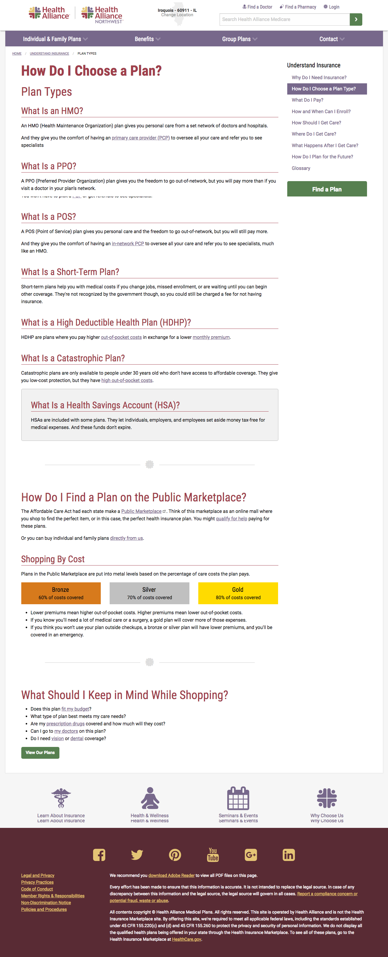
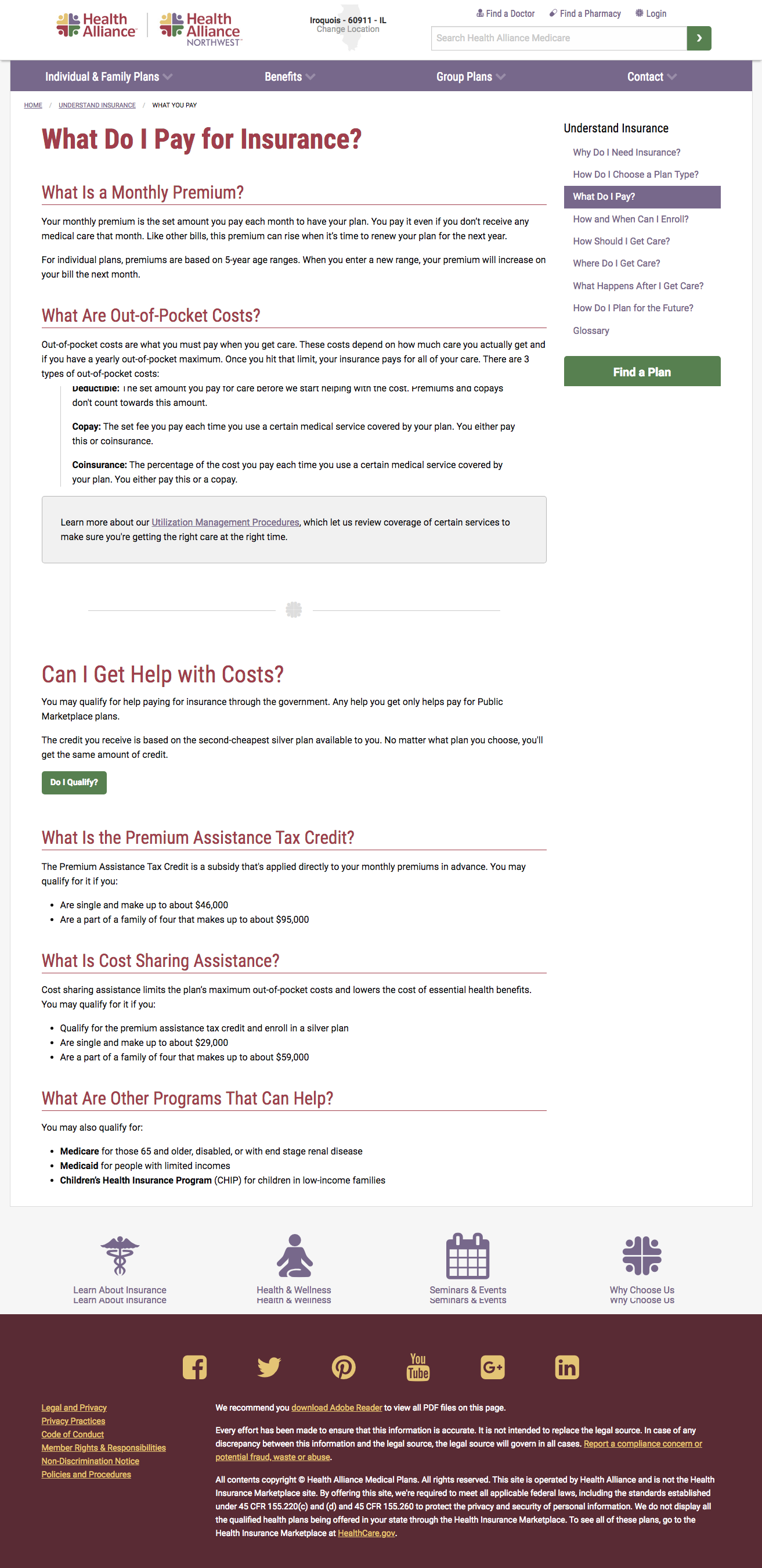
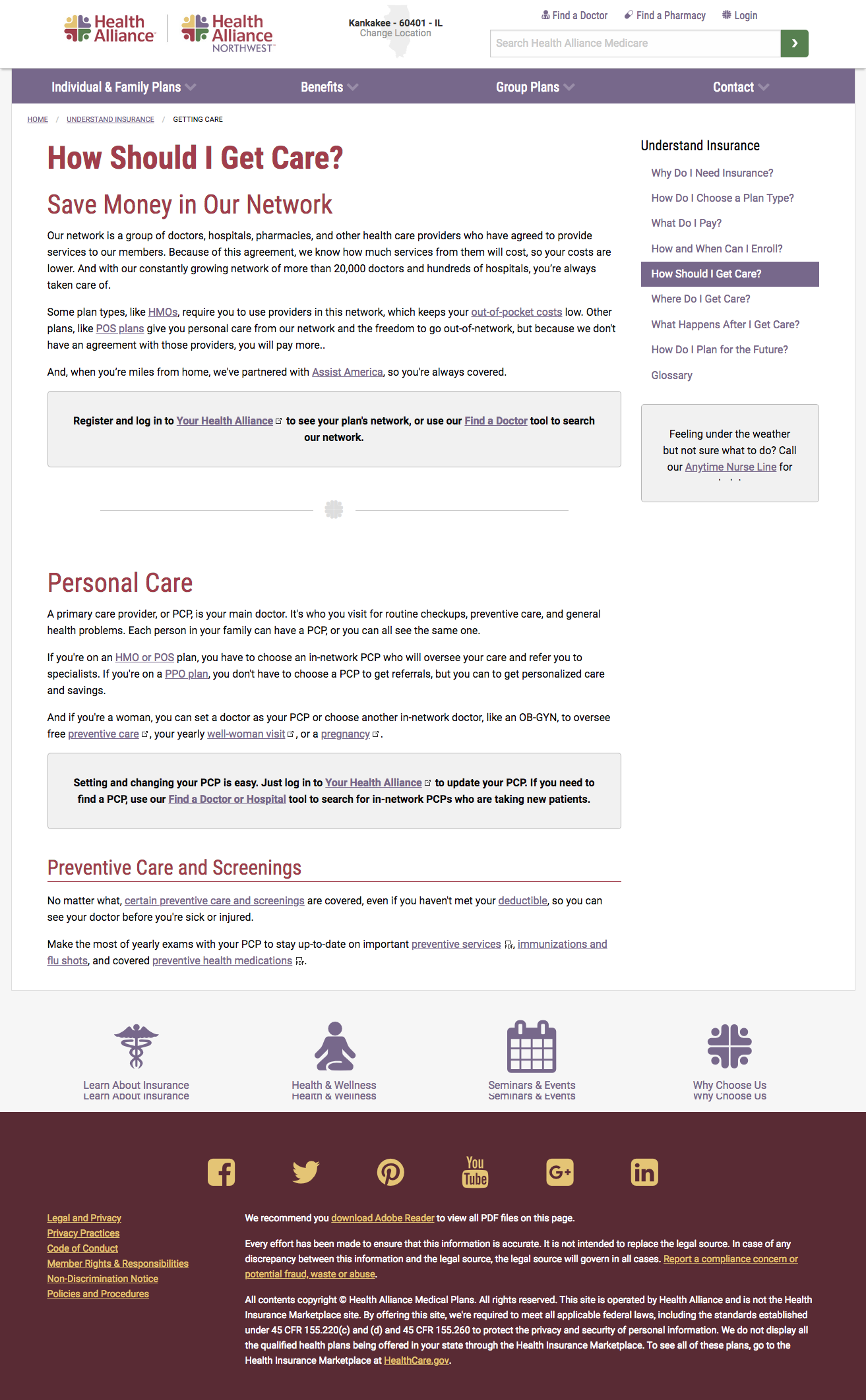
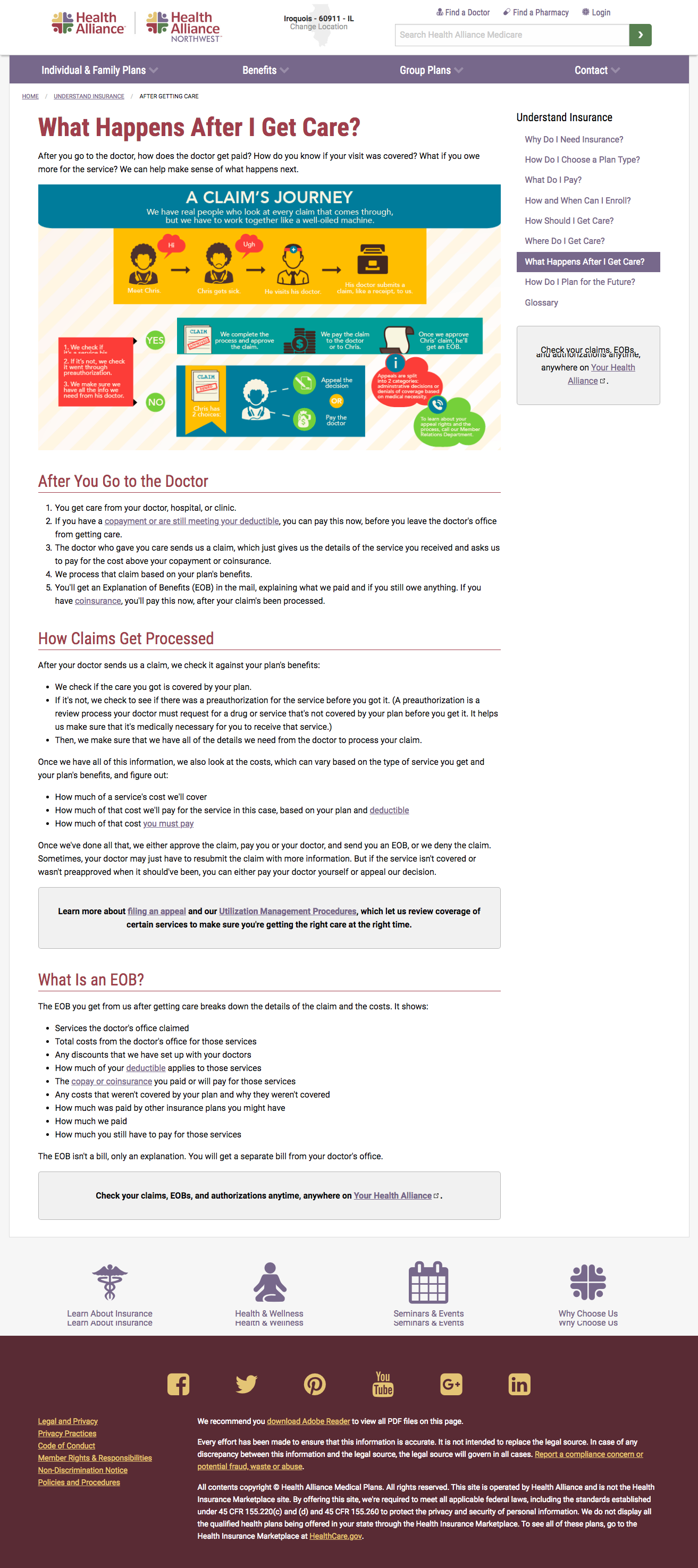
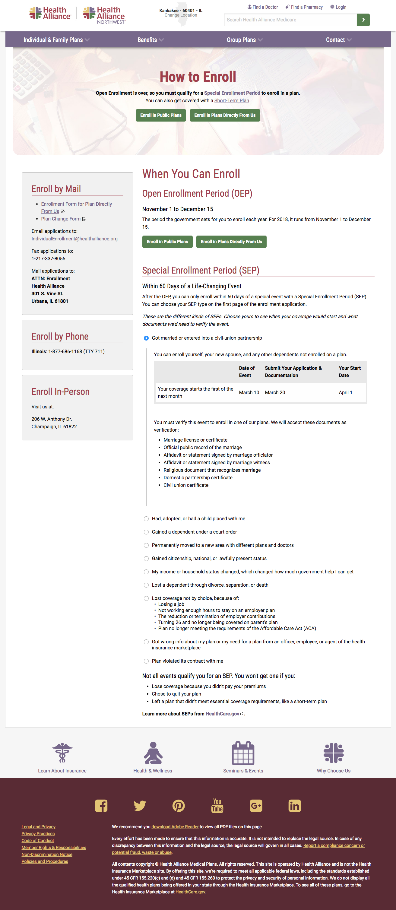
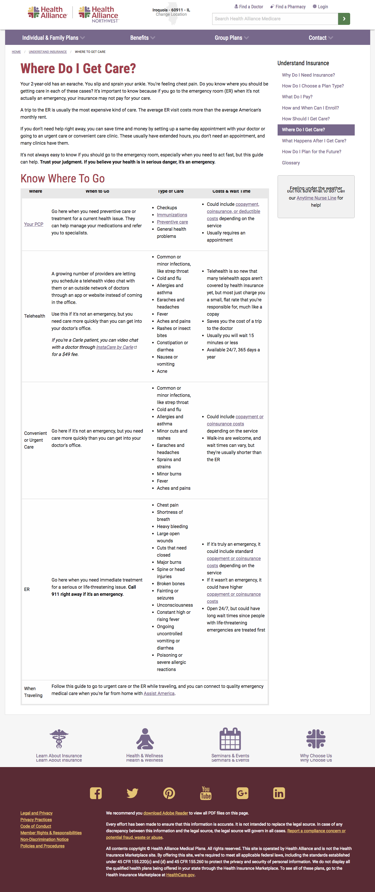
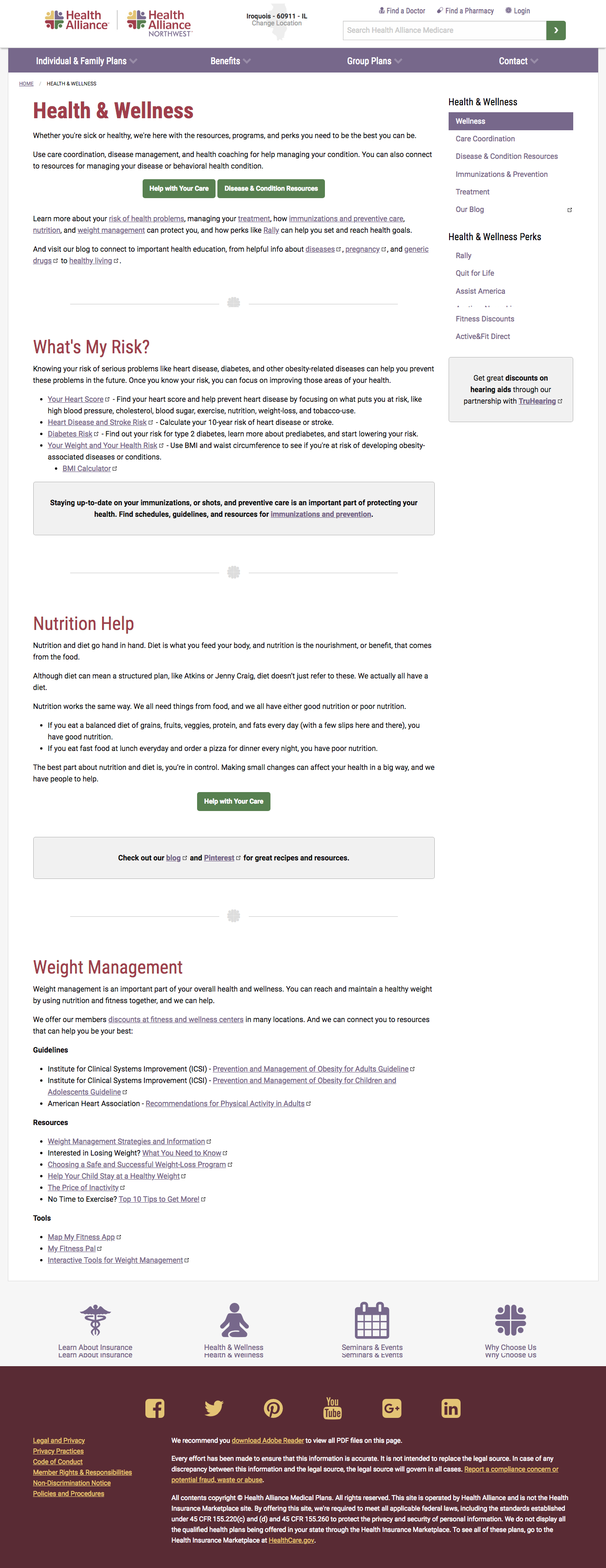
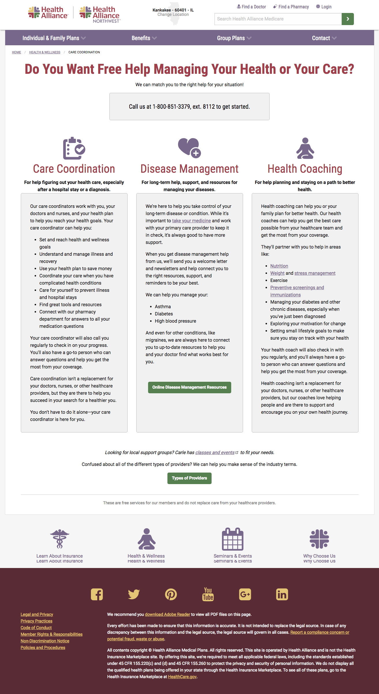
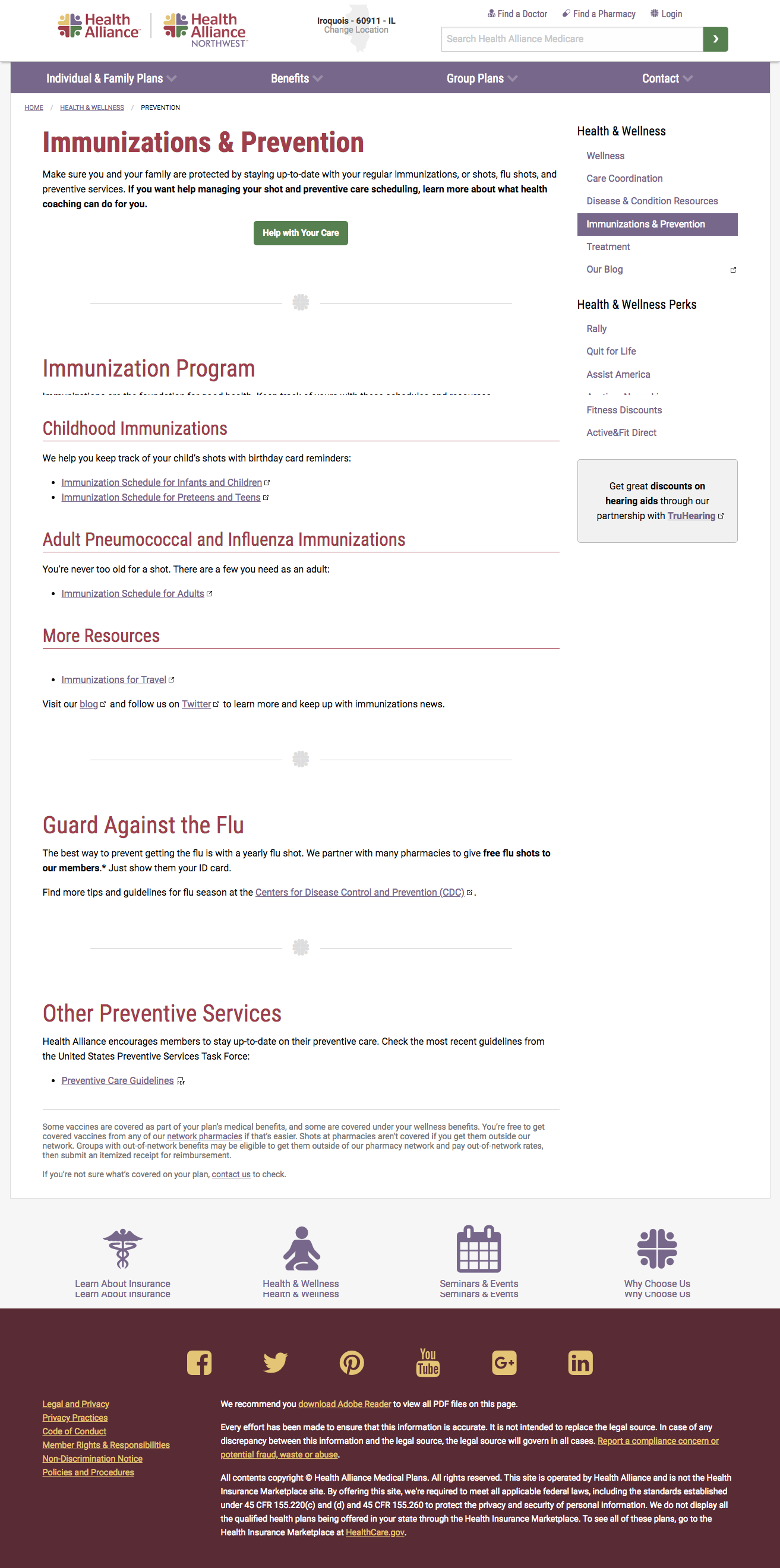
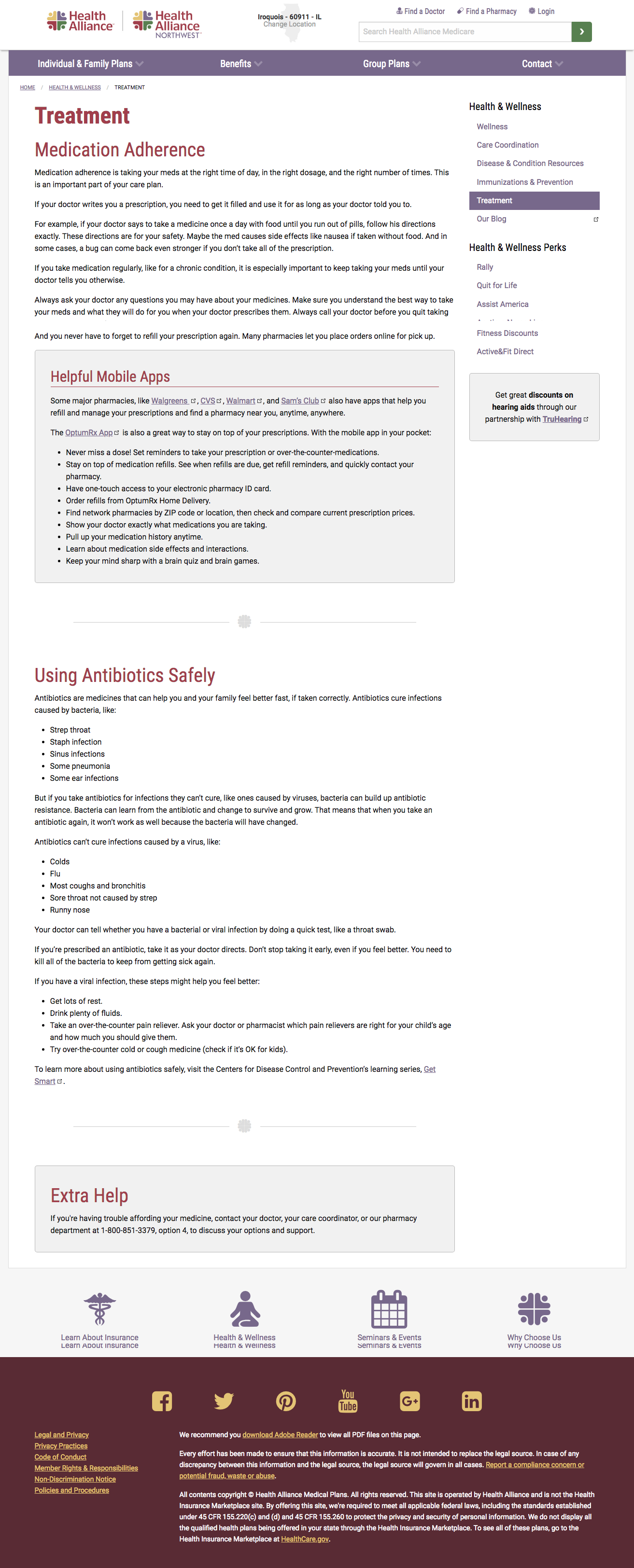
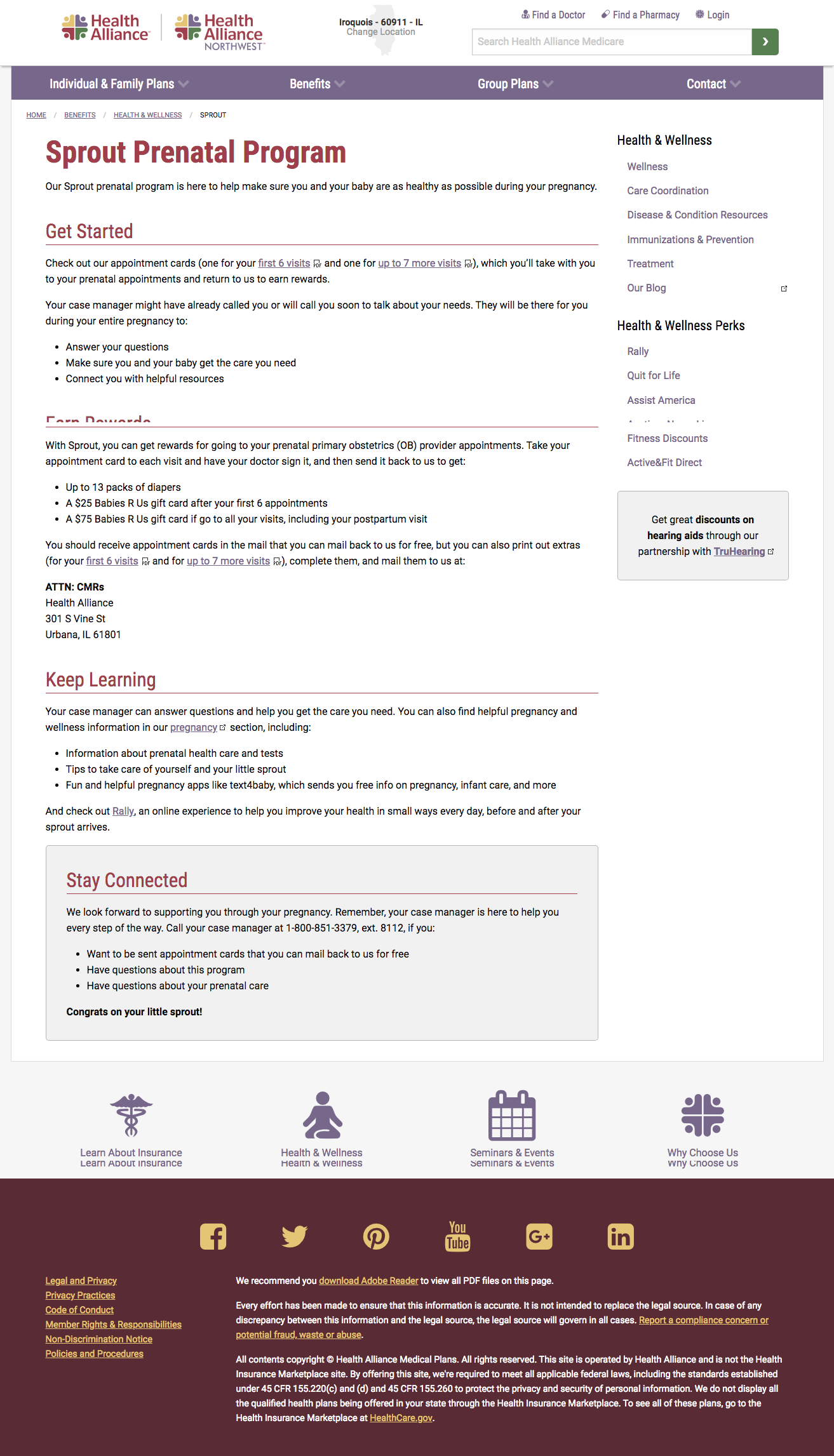
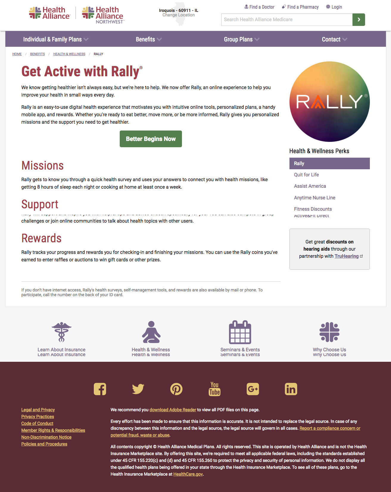
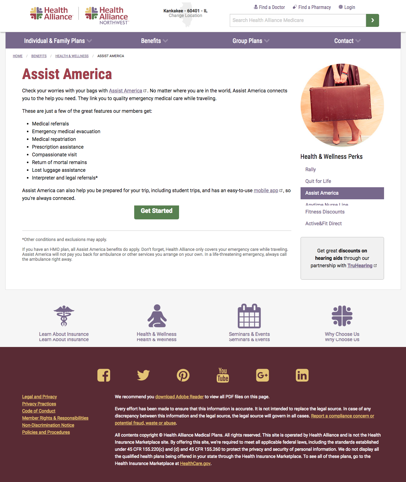
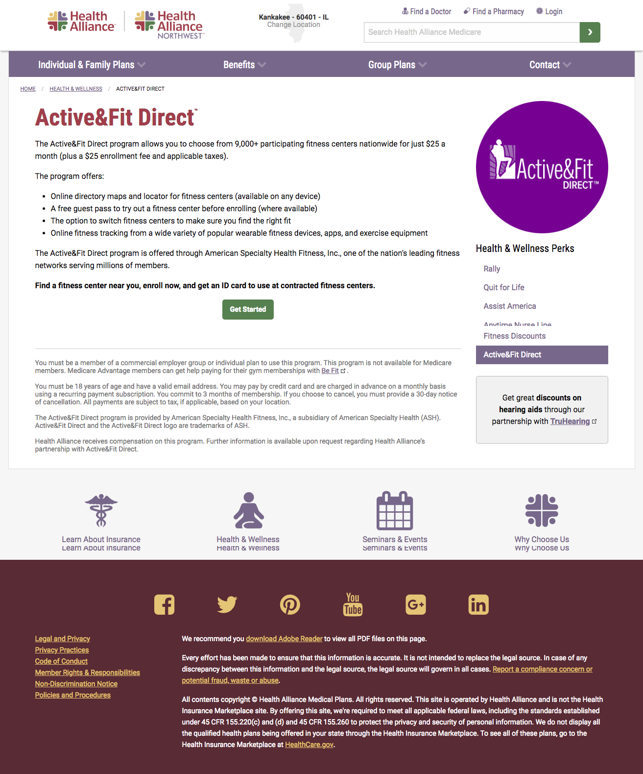
When I arrived at Health Alliance, I developed our web content style, based on Yahoo! style, as a basis to build our brand’s voice. From there, I rebuilt our content across every single page of our websites with clear, straight-forward, and friendly language to make insurance and its confusing terms easier.
Organization, consistency, strong calls to action, scannable writing, and avoiding repetition were key to streamlining our content. Reinforcing our brand identity through a narrative was also an important part of reinventing our websites and establishing a strong web presence.
User experience, intuitive design, and a sales funnel were also overarching changes in improving our sites’ experience and flow.
Through these changes, we lowered our bounce rate by 13.7%, and we raised our:
- Page views by 46%
- Pages per session by 55%
- Average session duration by 3 minutes and 26 seconds
- Number of users clicking the call to action by 27%
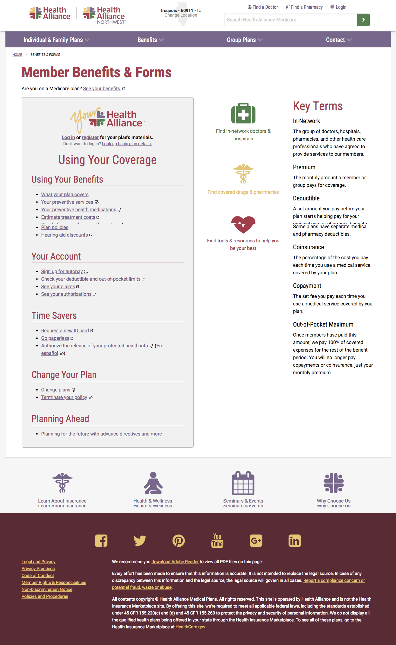
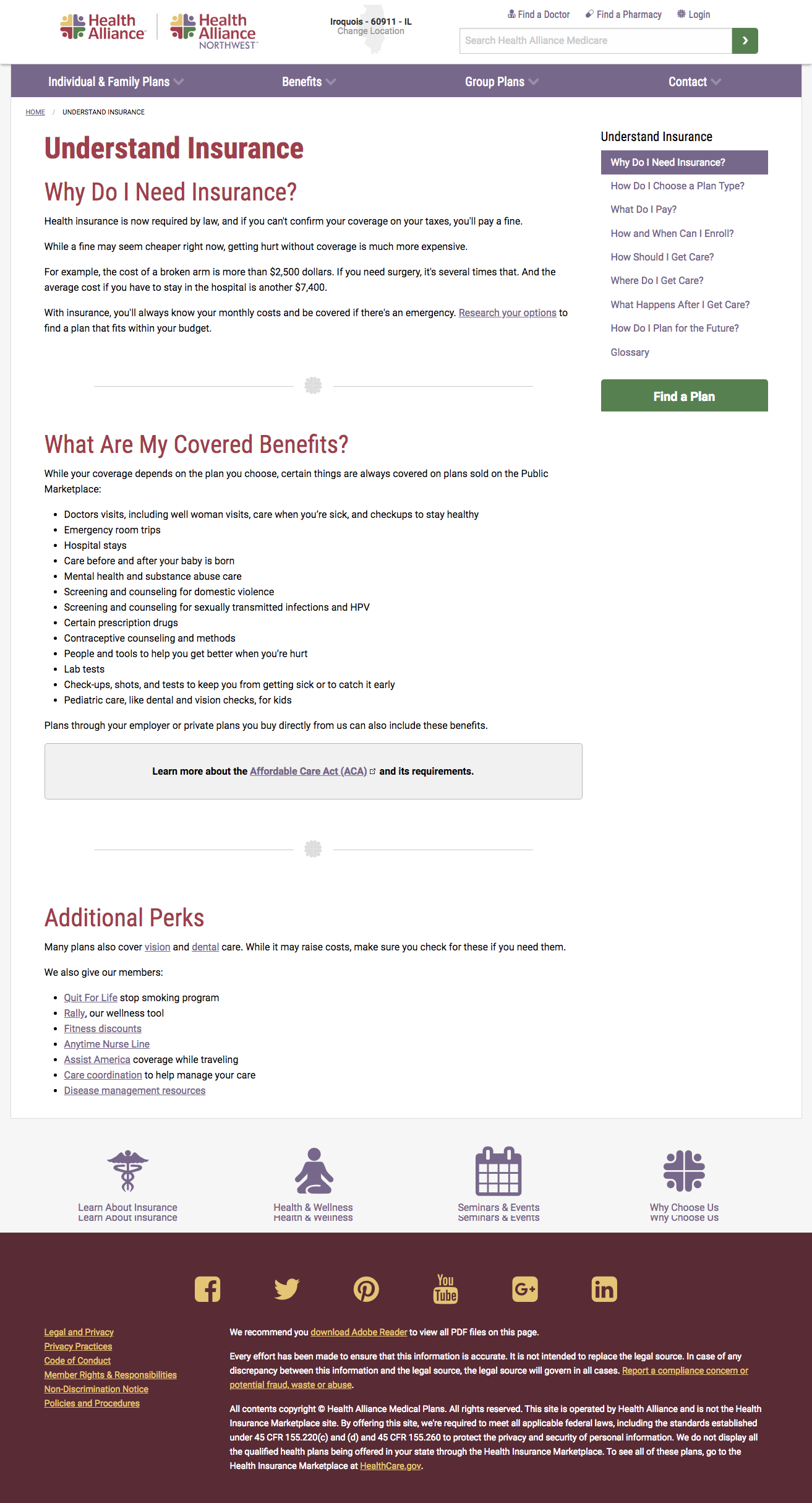
I also focused on building out education that helped people make sense of insurance. Our Understand Insurance section helped make sense of buying insurance and using it to get care, and our Benefits page was redesigned to help customers quickly connect to the resources they need most.


