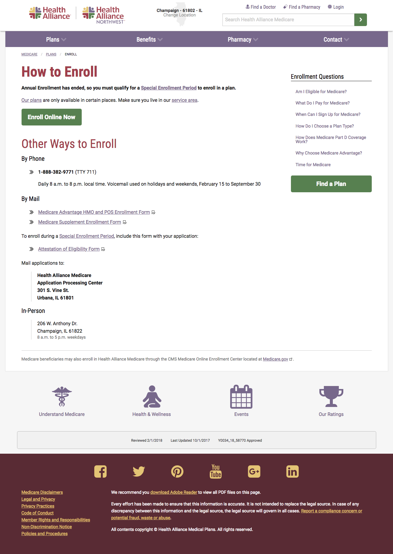
Medicare Website
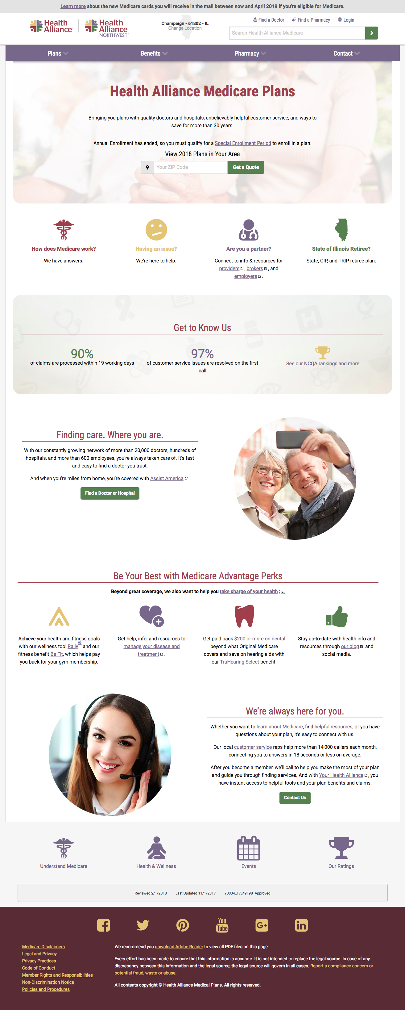
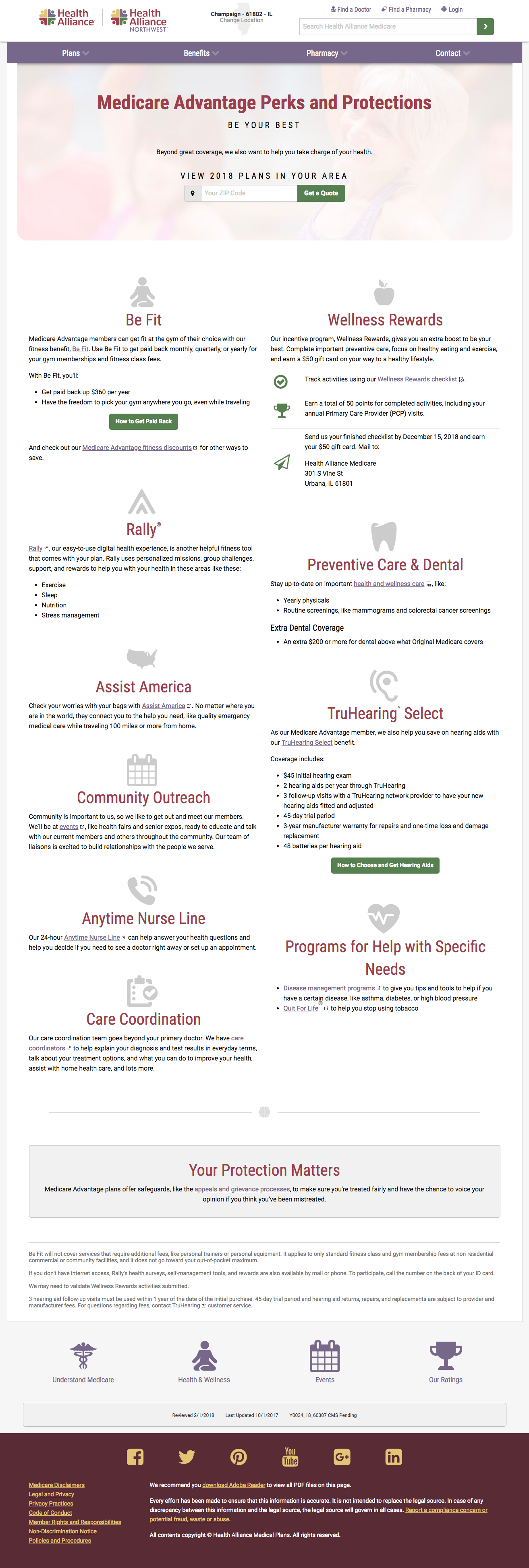
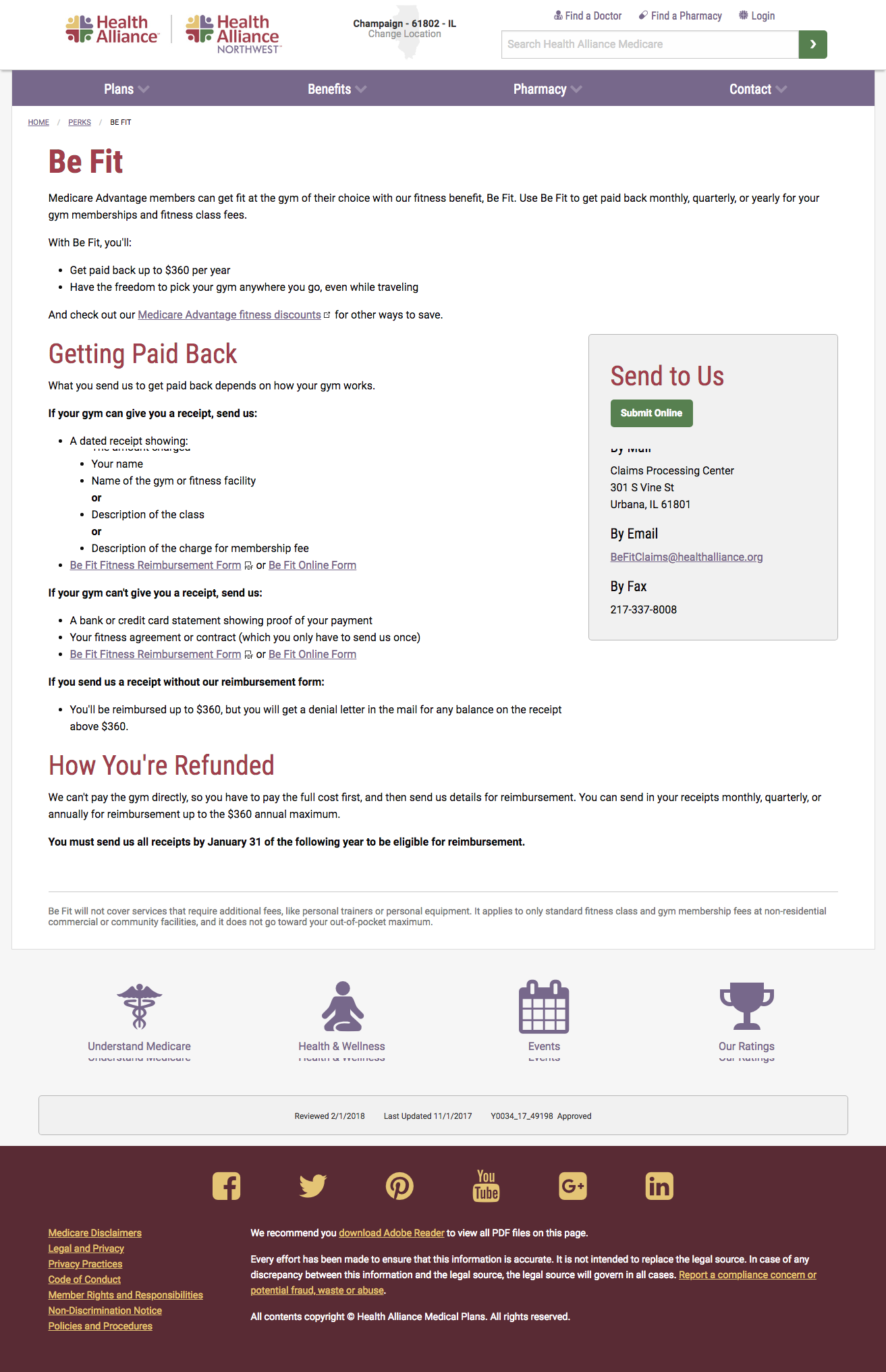
Just as I did with the main website, I rebuilt our brand’s voice on top of our new web style across every single page of this site. I wanted clear, friendly, and easy to scan content for our older members.
Organization, consistency, and strong calls to action were also key to streamlining our content. Reinforcing our brand identity through a narrative was also an important part of reinventing this website.
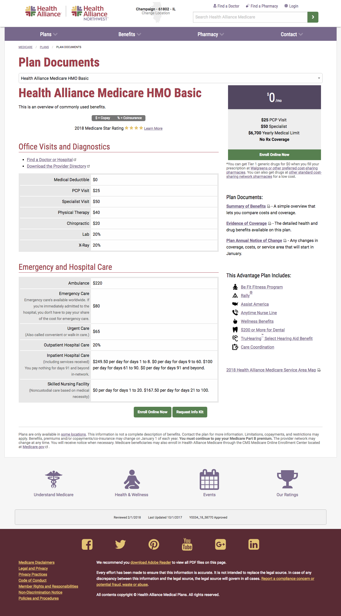
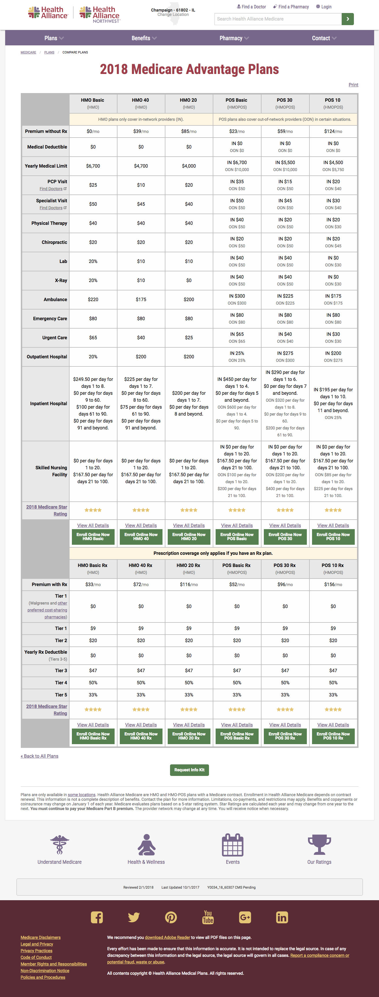
With searchable plan benefits pages, we were able to streamline sales funnel to help improve our user experience and the site’s experience and flow.
Through these changes, we raised our:
- Sessions by 69% the first year and 310% the second year
- Users by 51.5% the first year and 350% the second year
- Pageviews by 37.7% the first year and 198% the second year
- Number of users clicking the call to action by 24%
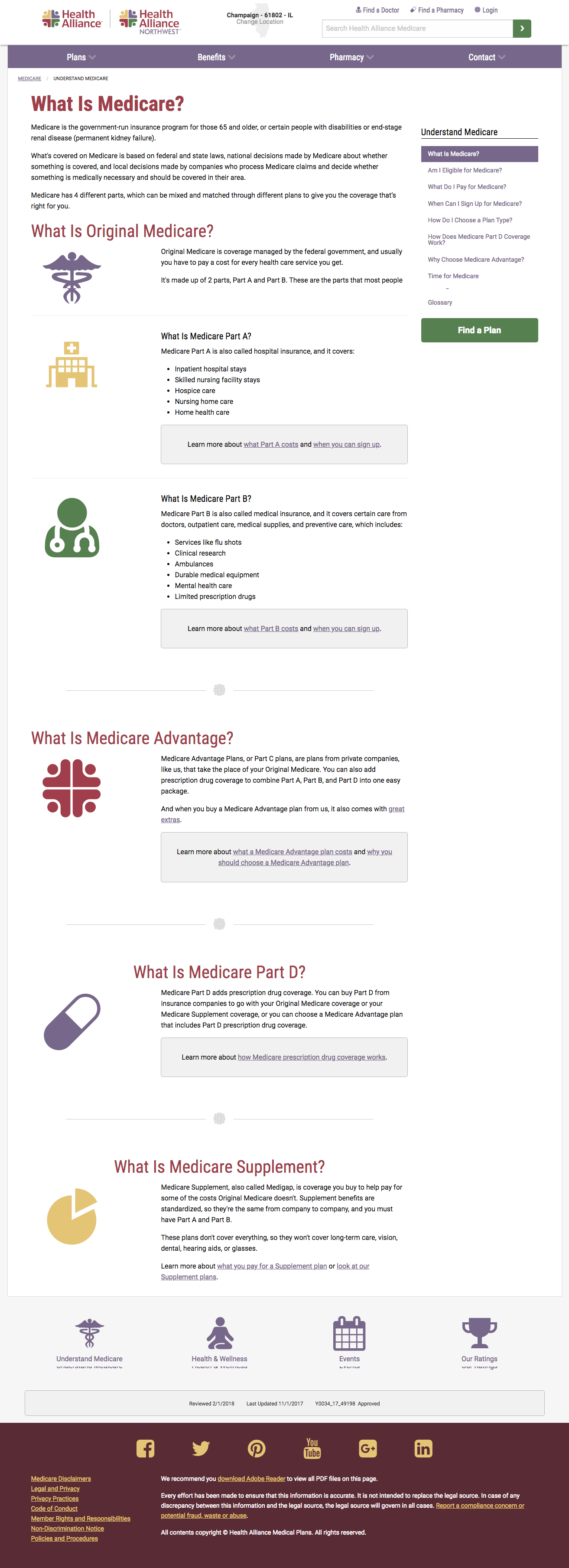
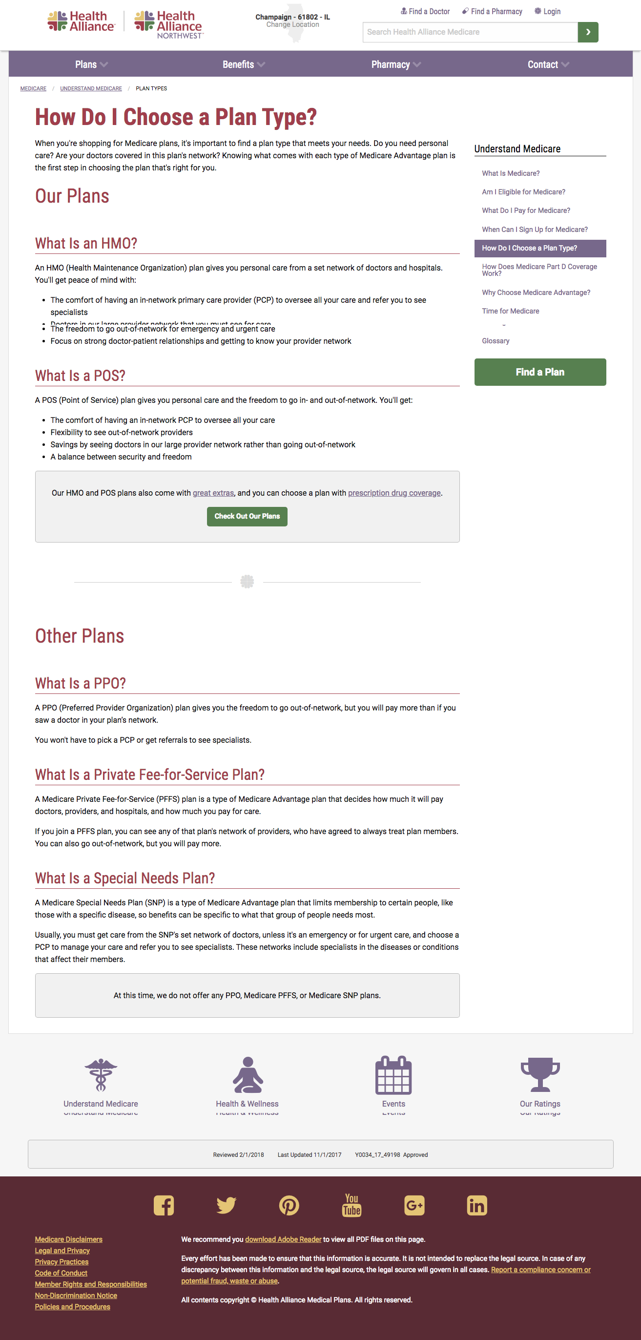
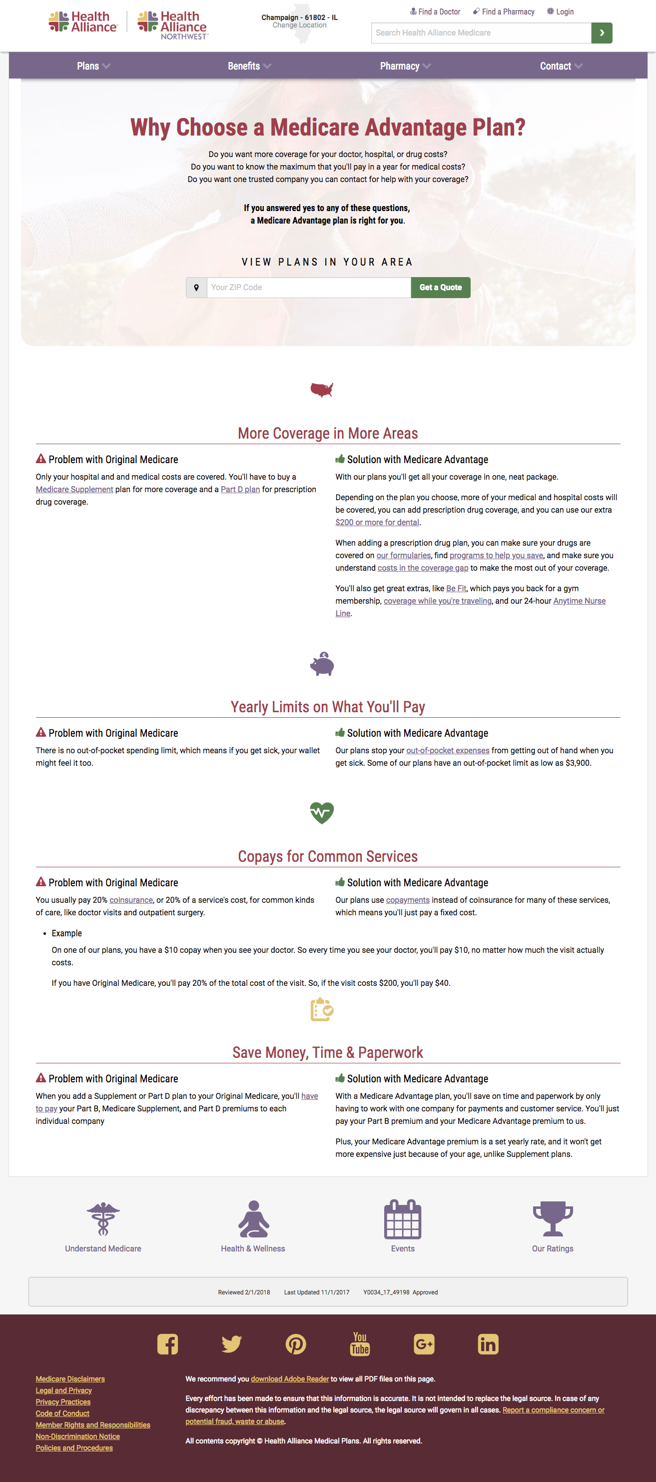
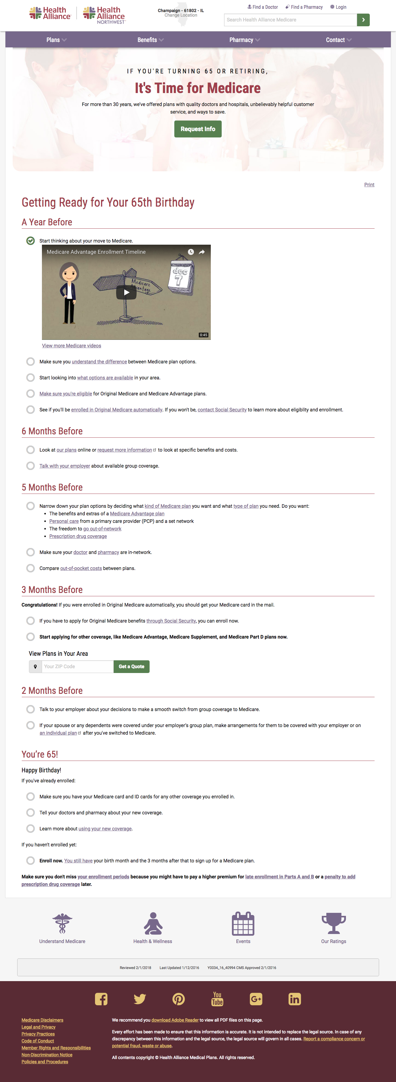
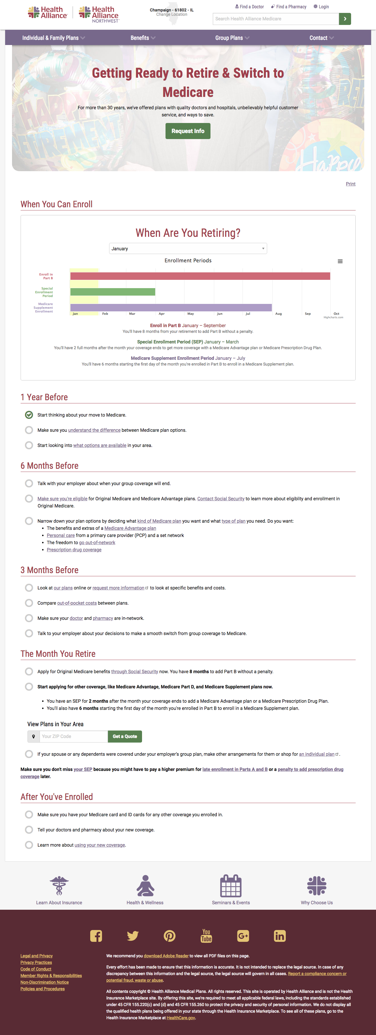
Here too, I also focused on building out education that helped explain Medicare.
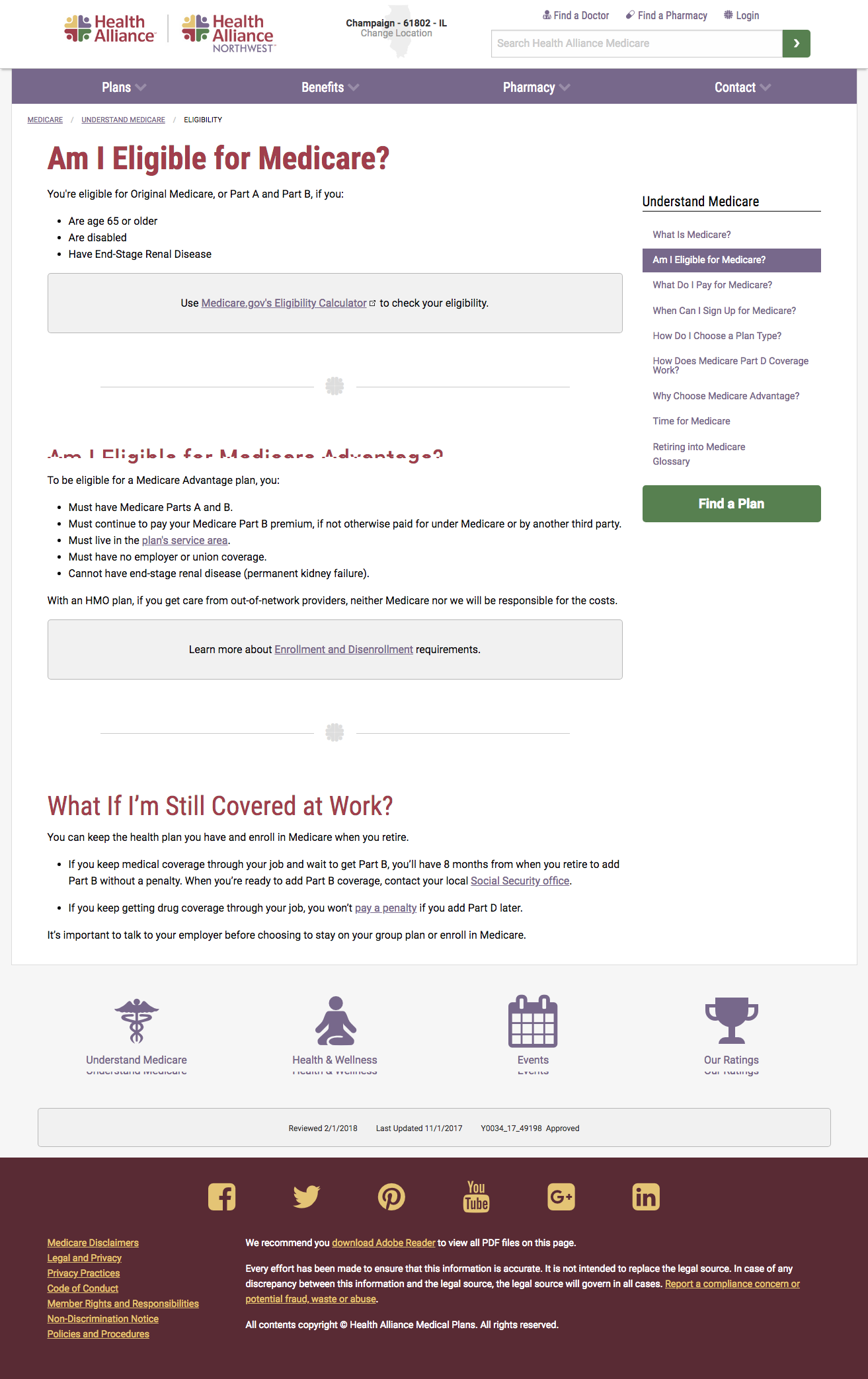
- The Understand Medicare section helped make sense of all the intricacies of Medicare
- The It’s Time for Medicare page helped those starting Medicare soon to make sense of the process with an easy-to-use checklist
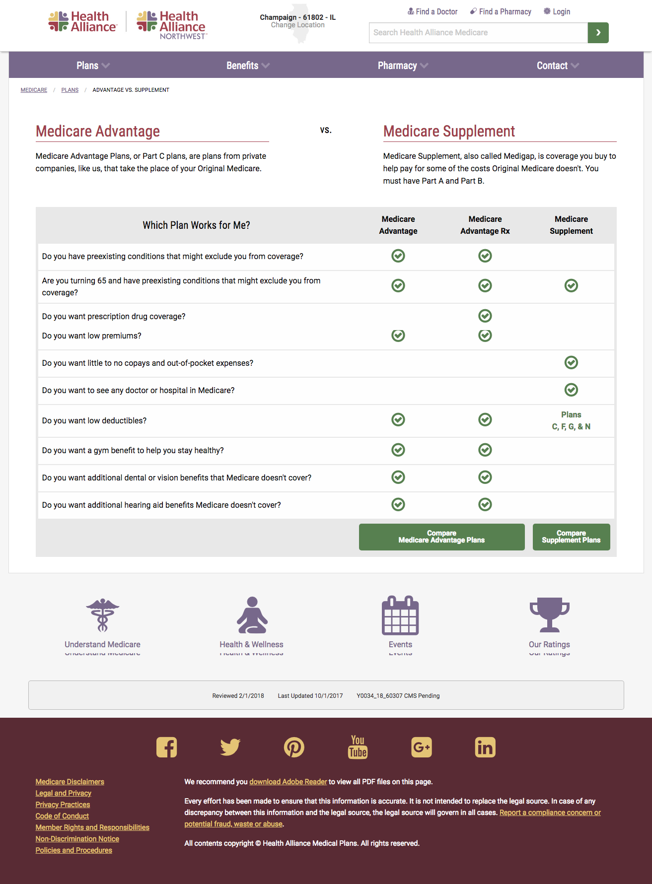
- The Why Choose Medicare Advantage? page helped break down the differences between Medicare Advantage and Medicare Supplement
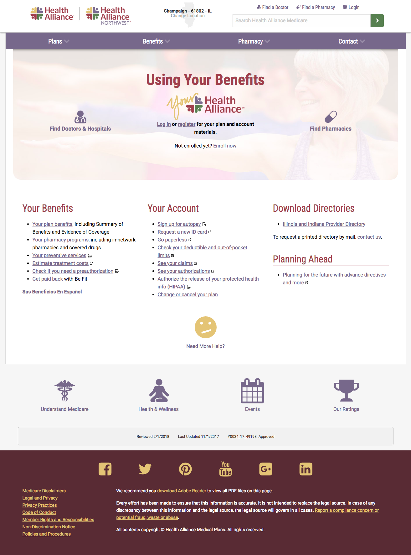
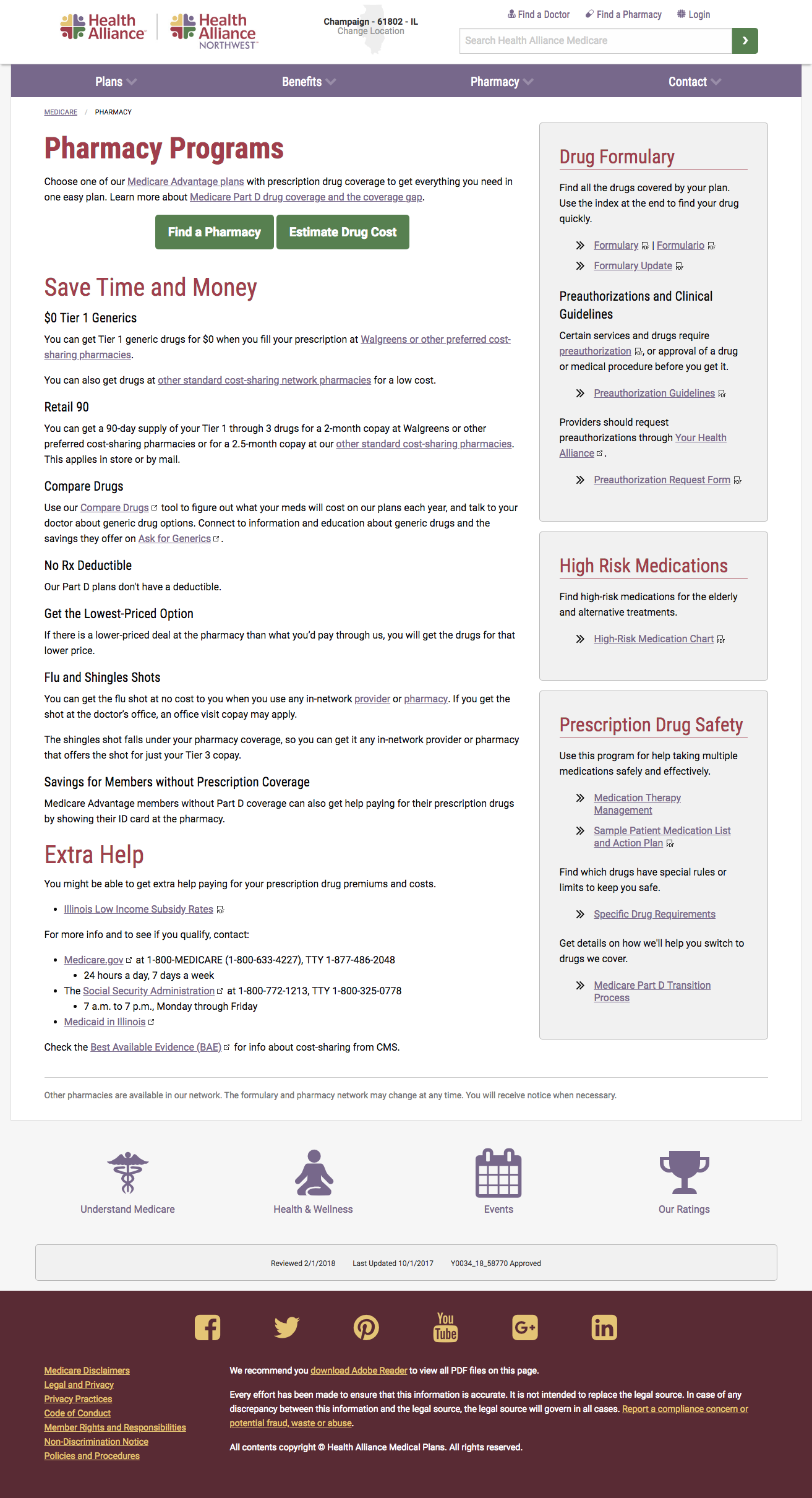
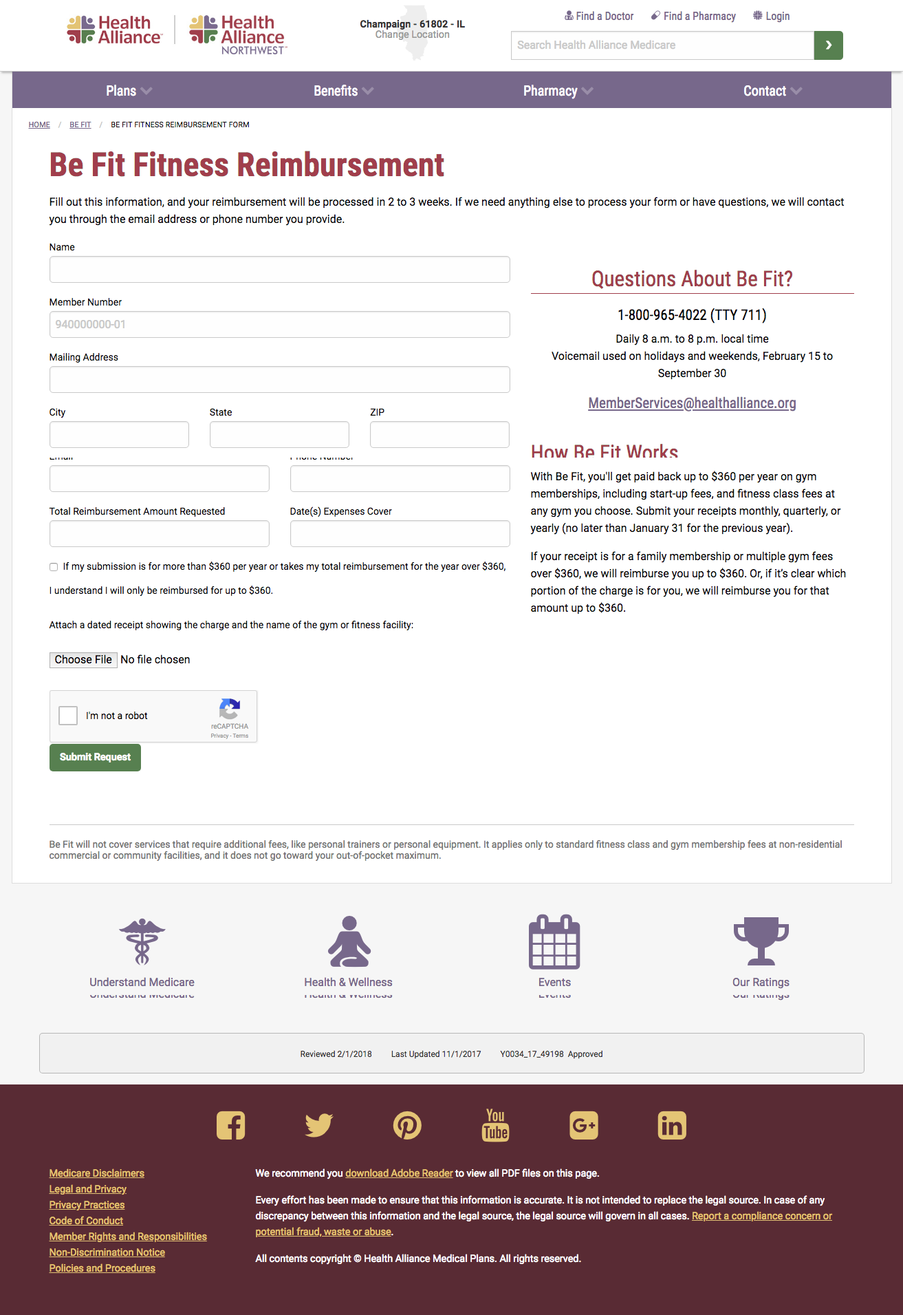
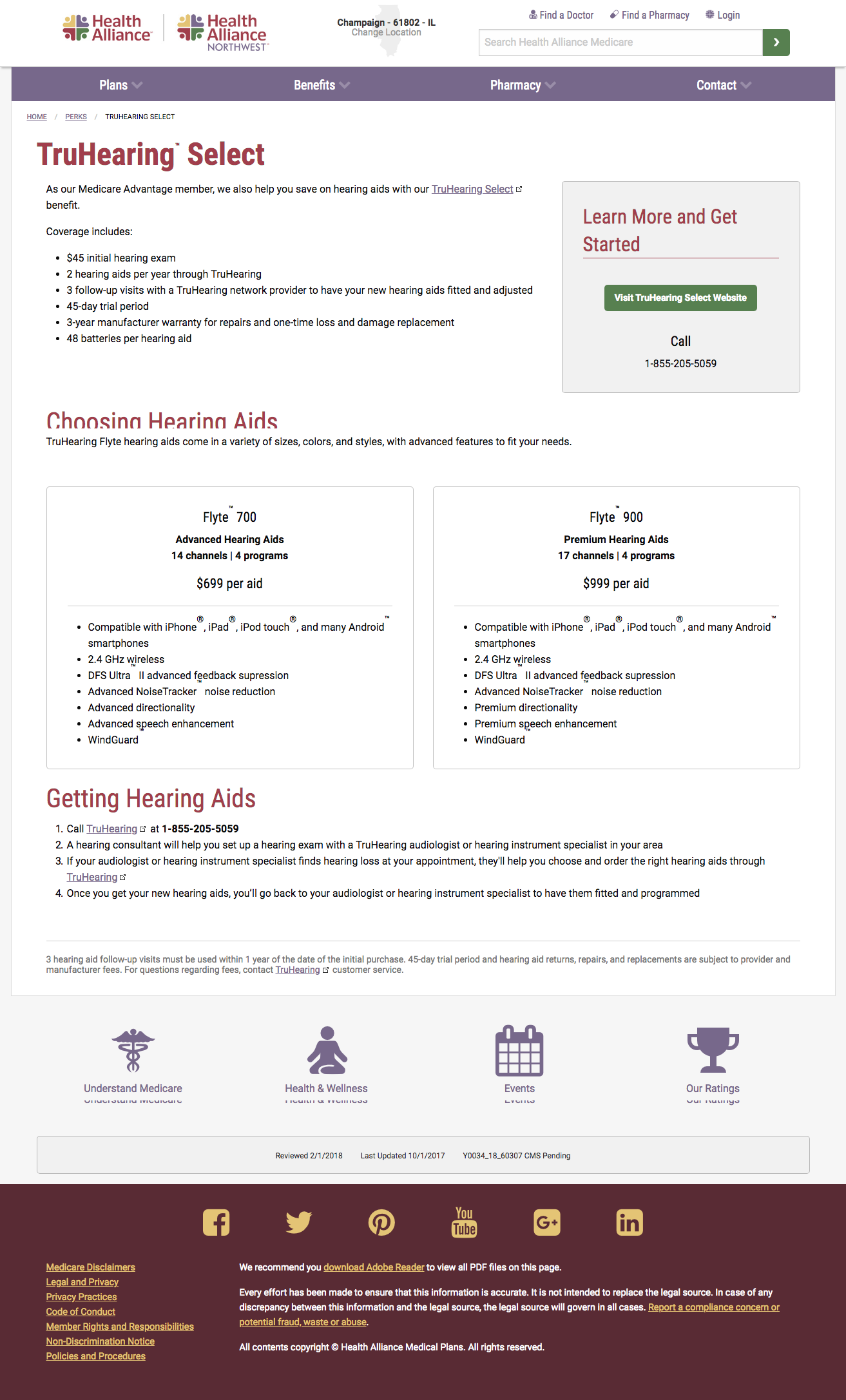
- The Benefits page was redesigned to help customers quickly connect to the resources they need most.
Key Plan and Landing Pages
Understand Medicare Education Section
Medicaid Website
When I first arrived at Health Alliance in 2014, we also had a Medicaid product. We focused on making their website as easy as possible to use, with quick links to help them use their coverage easily.


